


0242: Senators Re-Bourne
I know we just looked at a Senators concept the other day, but it's time for the next jersey set in Andrew Bourne's NHL makeover series. What do you think of his take on Ottawa's look?
 Chris
Chris
Andrew read through your comments and made some revisions to his Senators concept.
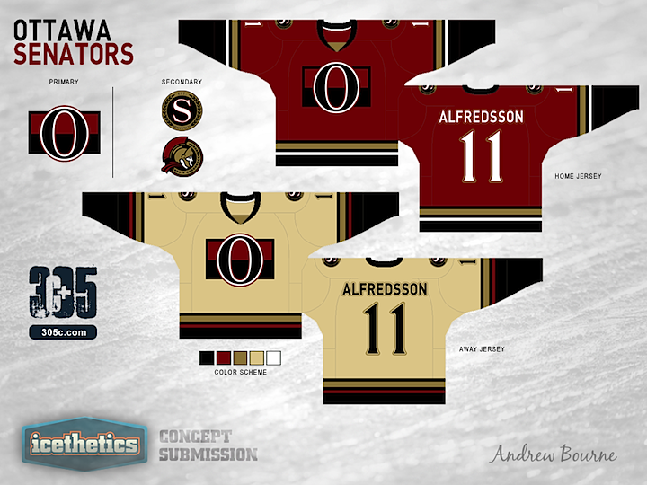
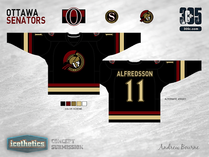
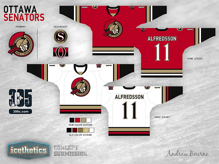
Colin M, Steve, Derek, Louie and Eaman12 either wanted to see brighter reds or a true white. So, here's both! Colin M, Derek, Garth, and Eaman12 didn't really like the use of the 'O' logo and I think I can see why. The circular Senator Head is much more strong and doesn't get mistaken for a Zero. I also thickened up my notoriously thin stripes and as for the lettering, I'm just using the Senators current font. Can't change that one... For those of you who embraced/defended the 'Ancient' golds (Jon93, Louie), Thank you! And to the rest, thanks for helping me try to fix the Sens!
Andrew Bourne 
Reader Comments (8)
The alternate is the best of the bunch. I really like the logo choices, the sens really have a fantastic set of underused logos to play with. I really don't like the box around the primary logo on the home and road sweaters, I also don't like the fact that the chest stripes cut off with the logo box. to me the whole look is a little too dark, using true white rather than vintage white, and a brighter shade of red would probably help a lot on this one.
I do like the design, and use of that logo, however the off white color should not be used. White instead of that color would make these look even better.
I disagree with the previous comments regarding off-white usage. I think if there's one team that can pull the cream colour off, it's the sens, a team with a rich history. I really like Andrew's work here. I'm not a big fan of the fact the sens currently use the same colour scheme as the devils, so giving their uniform an almost ancient look is a really good idea. Nice work, Andrew Bourne!!
I'd like to see the S secondary logo moved up to the primary spot and the vintage white replaced with regular white. Other than that I like the simplicity of this set.
Striping is great on home and away but why use that boring 'O' logo? Everyone wants a black jersey back for Ottawa make the third the home and put the Senator head logo on the away.
Really like these, and I love the striping. They are both a little dark though; maybe use a lighter shade of off-white (I think it works here, it's just a tad too dark), and a brighter red/burgundy. Only thing I'm not a fan of is the letters and numbers. The font is too plain while the numbers are too thin and very old fashioned, especially compared to the font. One might work without the other, but both of them there just gives it a weird contrast. Great concepts overall though!
Kinda boring
A nice attempt, but I've grown up around Ottawa my whole life and no sens fan I know would wear these; at least not right now. The vintage style is a nice nod to Ottawa's history but the colors don't feel right. You've taken inspiration from the past (which was just done with there 20th anniversary alternates) a little to much inspiration. More flash would do it good with bright reds contrasting with the crisp black on the jersey. To be honest the Sens are still college kids, this whole vintage garb just doesn't seem right for me (For future reference, hab and leaf fans refer to the O logo as a zero).