


Thursday
Oct182012
0243: Make Them Mighty Again
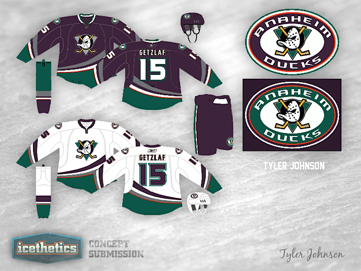
This is a classic merging of old and new. Tyler Johnson has given the Anaheim Ducks uniforms the retro treatment adding in old colors and logos. But one thing I really like about this one is the thin orange stripe. I won't go so far as to say it's good design, but it pops in a way I don't hate. What do you think? Should the Ducks have taken a similar route for their third jersey?
Designed by  Tyler Johnson
Tyler Johnson 
Reader Comments (12)
I like the idea of using the Ducks' old logo with their current jersey design. Not too hot on their old jade and eggplant color scheme, a bit too mid-90's for my taste. I'd be curious to see how this concept would look using the Ducks' current gold and orange, but swapping out the black for a dark green. That way it'd look like a real duck!
I like this alot. The Ducks current jerseys suck so hard they could pull a tennis ball through a garden hose. This concept is very good. I actually don't see anything bad in this concept. I would buy these jerseys if they were used.
I love it! Too many black sweaters in the NHL. The thin orange stripe is a great nod to the County they play in, as was the rebrand's original intention. I love the purple and jade and hopefully they bring it back. The classic duck goalie mask is a great logo as well.
I would only recommend replacing the shoulder patch with the "D" logo (without workmark). That would really complete the jersey!
I like the old colors. Something different for once.
YES!!!!!!!!!!!!! PLEASE!!!!!!!!!!!!!!!!!!! i love these old jerseys only thing bring back the old shoulder patch. http://sportslogos.net/logos/view/4/Mighty_Ducks_of_Anaheim/1996/Alternate_Logo
I think the logo is a classic and the colors work too, but I don't think the curved striping works with it.
This is a good concept but the orange doesn't fit in well. I'd like to see the Ducks keep their current jerseys but put the Mighty Ducks logo on front of it - with updated colors of course.
You need to teach them how to fly Gordon.
It isn't mentioned in Chris's write up, but the orange stripe is intended to represent the Stanley Cup they won. Similar to the Islanders old shoulder patch.
I like the look, but the old logo is incredibly dated. The shoulder patch with the duck mask looking straight ahead would in itself make a great logo. But honestly anything other than that word mark with the duck foot is better.
Love the colors but I'm not a fan of the bottom swooping stripe. A little too close to the crest for me.
Thats funny just the other day i seen the old ducks jerseys and wondered what they would have been like with the reebok edge design.. these dont look too bad, take away the orange stripe.. good work!!