


Wednesday
Nov142012
0270: Coyotes Re-Bourne
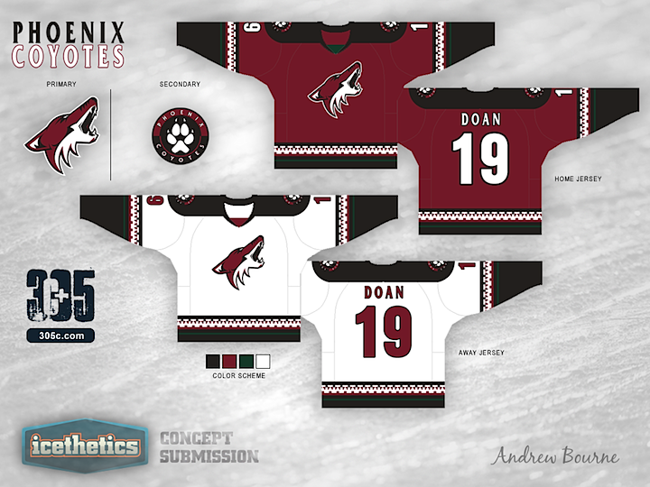
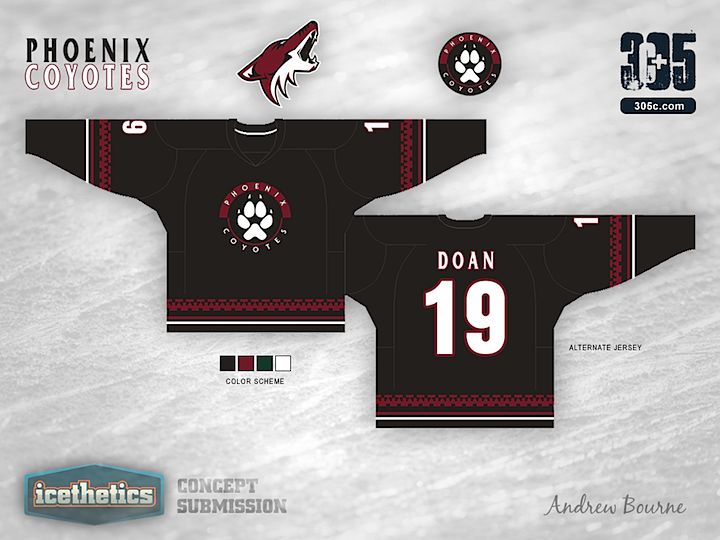
We haven't seen much from Andrew Bourne these days, but not to worry, there's still plenty more to come. Today, his NHL makeover series looks at the Phoenix Coyotes. It's a unique set that very clearly combines the team's current look with it's old one from the late '90s. What do you think?
Designed by  Andrew Bourne
Andrew Bourne 
Reader Comments (10)
Too much black. The green is really unneccesary, because of the way it is used ionside the blak, there is really no point in using it.
I love the design, but the only thing I have a slight problem with is bringing back the green, it just seems so out of place in the color scheme
Probably his best set yet. I really like those.
I wish they would go back to this style of uniform. I loved them!!
Needs More Moon.
The designs are fantastic. Really love the stripe design, never understood why no one liked it before. Thought it was creative and still not too crazy to work.
The only thing for me, is i wouldn't go the Black route, i would try and stick with the current colour scheme more, maybe have some black highlights here and there, but not solid black stripes.
I think you also pulled off a really nice black jersey, which i'm never usually a big fan of. Which means nothing.. cause its an internet opinion... I could imagine that crest looking really solid.
I will say, i would love to see a version of the moon on here as well though, always thought that was a nice simple secondary logo.
Really loving some of the designs recently, i think the community as a whole seems to be making stronger and stronger designs, makes me want to start getting back into it.
While I'm a big fan of their current jerseys, I actually think this one looks even better. Great concept!
I'd buy these buy the bajillions. Wayne changed the scheme to the Sault Ste Marie greyhounds, a team which he used to play for. Maybe a green border on the lttering to go with the stripe would be subtle, but either way. Fantastic.
Seems like an odd logo for a Seattle team.
Andrew's stuff keeps getting better and better great job combining old and new, two jerseys that I have always loved coming together keep it up.