


Saturday
Nov172012
0273: Waddell's Winter Classic, Part 2
 13 Comments

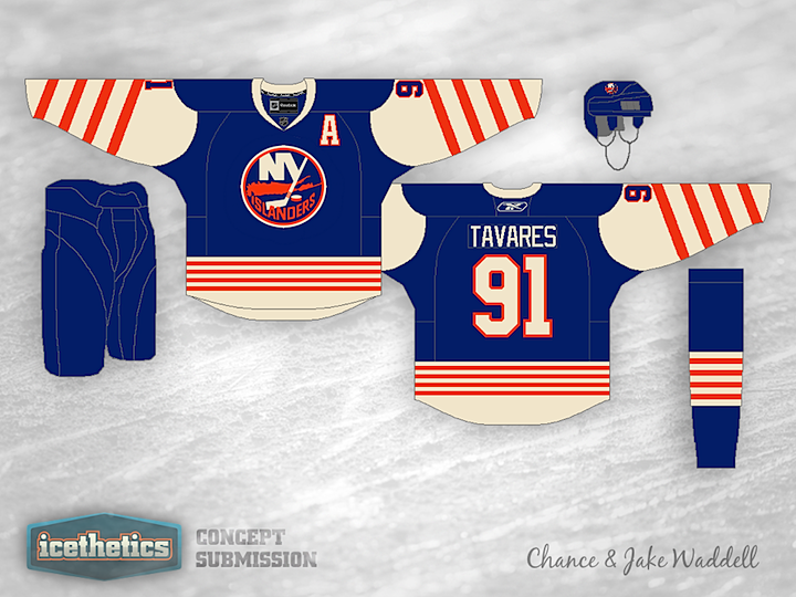
I debuted a new Winter Classic series by the Brothers Waddell last week. Chance and Jake have designed retro-style sweaters for all 30 NHL teams. We started with the Kings and Penguins. Then the first to comment on that post got to pick the next two teams; Brian chose the Rangers and Islanders. (Unfortunately, that meant posting three different Islanders concepts this week. But I'm keeping my word.)
Same deal this week. Which teams should we look at next Saturday? Be the first to comment.

Reader Comments (13)
Anaheim and Florida
Canucks / Lightning
Lol, I feel so special. Anyway, Nice concepts. I could see the Islanders wearing those maybe minus the stripes.
Hooray! Panthers are in the next group! I was going to say Florida and Nashville, but I'm glad that the person who beat me to it asked for the Cats.
The Rangers concept is interesting, and I can't tell if I love it or hate it. I do wish that the diagonal stripe went into the shoulder yoke rather than just ending. The Islanders one is very cool. It doesn't fit the whole throwback template for a Winter Classic, but it's a cool, original design.
Is it weird that I kind of like the diagonal stripes on the Isles jersey?
I actually kinda like the Rangers concept, but like the poster above said, the diagonal stripe should go into the shoulder yoke. It looks "off" by going into the waist stripe, but ending before the shoulder.
the isles jersey hurts my eyes when i look at it for too long!!! waaaaay too many stripes.
and the rangers jersey just needs to lose the across the chest stripe and its ok.
Can't say I'm a fan of either of these. The diagonal stripe on the Rangers jersey reminds me too much of a crossing guard and the white sleeves/megastripe combo for the Isles makes the jersey look like a weird vest with white shirt underneath. Simplicity works for winter classic jerseys.
Hate the Rangers jersey. God awful. I like the Islanders' very much more, except I would make the diagonal stripes vertical, and reverse the colors for all three portions of the stripes (two shoulders and the waist). Otherwise, great jersey for the New York Islanders.
I'd love to see a Minnesota v Colorado WC.
Do not like the Rangers jersey one bit, from the diagonal stripe to the recycled logo. And if they played in the WC together I doubt they'd both wear blue. The Islanders jersey is nice though, could use some fine tuning though, but overall a good concept.
Hey guys. Sorry the Rangers' stripe stops early, I wanted it to be at the same angle as the diagonal on the logo, and I wanted the arms on the Islanders' jersey to look like lighthouses, so that's why the stripes are diagonal.
Like the Islanders more than the Rangers one.
Unlike a few of the previous posters, if I had a choice between the chest stripe or the waist stripe on the Rangers I'd probably lose the waist stripe instead. 2nd choice would be to lose both stripes.
Like the diagonal stripes on the arms of the Isles a lot - great look. Lots of small waist stripes may be a bit much - either a thick stripe instead of the numerous small ones, or eliminate the vintage white and orange at the bottom of the jersey and make that section all blue.