Wednesday
Nov212012
0277: Philadelphia Grey
 Wednesday · Nov 21 · 2012 | 9:00 AM PST
  14 Comments

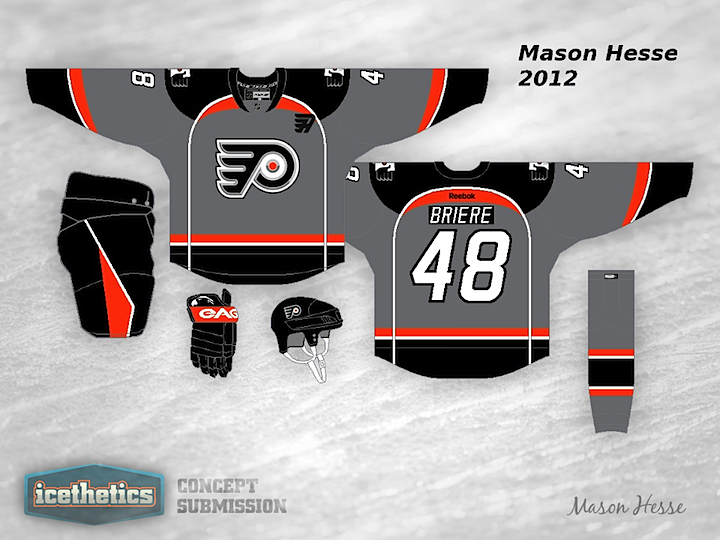
Gotta throw in something a little outside the box every so often, even though I realize it may not be the most popular thing. Mason Hesse is trying out an interesting grey jersey for the Philadelphia Flyers. And to be honest, I really like it. How about you?
Designed by  Mason Hesse
 Mason Hesse


Reader Comments (14)
here's the first mistake he made, i'm pretty sure those are the pants that the penguins wear. that's a no-no. second off all, there's no need for grey.
The font of the numbers and the name looks similar to the Carolina Hurricanes.
Looks too much like a photograph negative. Makes my eyes hurt.
I like the basic layout, design, and even the color looks good (though I wouldn't want to see the Flyers in grey more than once a year). It's the details that I don't like - the C/A patch, the shoulder patch, the name/number font and contrasting nameplate (of which I am a fan on the current home/road kit...I just don't think it works here). It's 3/5 in my book - unique design that looks cool with a few key things that I'm just not personally a fan of.
Don't mind it at all. The orange really pops out at you.
I also like the shoulder yoke, which I don't think we see on any current jersey. (Please correct me if I'm wrong.)
The Liberty Bell secondary logo might be a good idea too, although I wish I could get a better look at it.
If I have a complaint to make, it's that the grey/silver outline in the logo tends to blur the black a bit, especially as there's a change in hue. Perhaps instead you use a silver dot in the P, and then outline the black with orange?
Also, that black "A" needs a white outline, or at least make it white with a black outline like the numbers.
I don't think this concept wouldn't work on a regular basis, but it could suffice for a third jersey.
I hate that template. Why do all sports teams need unnecessary piping? Also, the Flyers are Orange (and sometimes Black).
http://www.nhluniforms.com/Blues/Blues16.html & http://www.nhluniforms.com/Predators/Predators06.html
is it really necessary to have another team jersey with the same design as two other teams? not enough contrast between the black and grey for my taste.
Sure can't see the flyers wearing those... But I love the creativity, and I like the jersey. As previously mentioned, the orange does pop out nicely.
to much like a Blues and Preds jersey
I really love the idea of a grey jersey. However, that logo sucks and it shouldn't be used anymore. Why not use the regular logo? Also, as posted above, the jersey template is just a copy of Nashville/St. Louis'. The piping ruins the template in my opinion. I think the 'A' is a bit too intricate, but I also think Calgary's 'C' and 'A' are ridiculous so maybe I'm in the minority there. The numbers need to stay uniform to Philadelphia's current scheme. I love the liberty bell shoulder patch. Again, I really love the idea of a grey alternate for a team. I think the Flyers have one of the best opportunities to pull this off too, as the orange really does contrast well with it.
Gray could be interesting, but that jersey is just bad. It looks like it was designed by the Ducks, and that's not a compliment.
Try putting the classic flyers template in gray as your starting point. Maybe add a detail or two, but remember, less is more. The piping looks stupid, the 3-d logo is awful and was rightfully allowed to die a quiet, undignified death, the pants use a pattern way too similar to the team's largest rival... Sorry, but try again.
Lose the apron strings and it would be vastly improved. Overall, I kinda like it.
@ RYAN: I agree with you! I'm a Pens fan and I HATED it when the Flyers went with a black jersey. The Flyers are/should always be Orange! As much as I hate them, it was nice to see the Flyers come to the Civic Arena in the 80's and 90's with Orange uniforms. Bring back home team wears white!!!!
Ok this is very well done but it is far from what the Flyers should ever wear. As a Flyers fan you just simply do not add grey to our color scheme, I hate the 3D logo but wouldn't mind it as much as a shoulder patch. I also do not like piping on jerseys especially old skool teams (that piping is so nashville) and as Sean mentioned those pants belong to the pens.
What I do like alot is the liberty bell patch, I've been stressing that Philly teams should totally use it more and made a Flyers concept of my own with a liberty bell patch on the yoke.
As I said this is a very well done concept but its just not the ideal look for the Flyers.