


Tuesday
Nov202012
0276: Sharks Re-Bourne
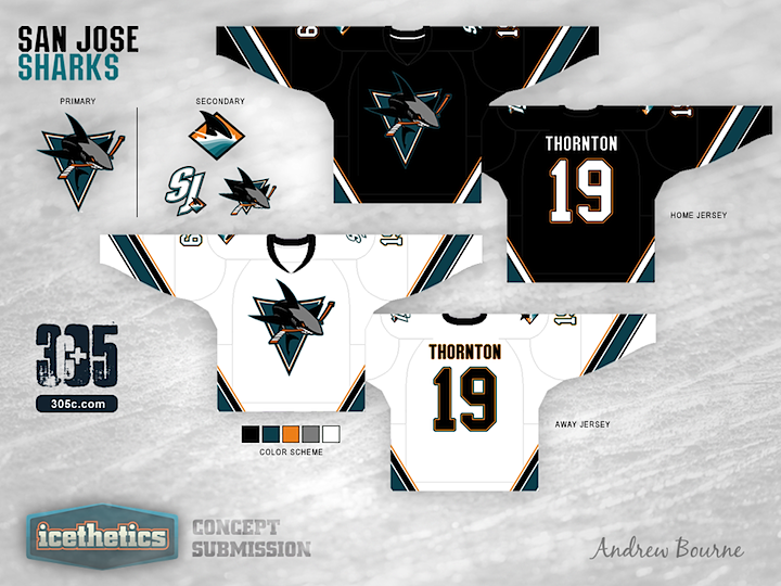
Andrew Bourne picks up his NHL makeover series today with this revision of the San Jose Sharks' uniforms. How do you like the grey shark? Just a few more teams left in this series.
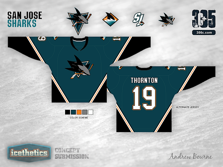
Designed by  Andrew Bourne
Andrew Bourne 
Reader Comments (8)
Haven't been the biggest fan of this series until the more recent re Bourne's. However this one is top notch I must admit. Well done, I like the uniform design, and the gray shark is phenomenal. Just my opinion though.
I really like the white jersey - crisp, clean, and unique, while not being hard on the eyes. The grey shark makes for a more interesting logo, but I prefer the isosceles triangle over the equilateral one. I also prefer the striping on home/away sets over the 3rd, but regardless, this is still an improvement over the current Sharks design. Nice work!
liking these 3 a lot, only one fault, white sleeve numbers on a white jersey doesn't work. how about teal and grey instead??
Full disclosure, I'm a Sharks fan, so these feel kinda different, yet very familiar. The black jersey resembles the Sharks original black alternate (which is a good thing). I like how Bourne's incorporated gray for the shark (give some kids a 64-count of crayons and ask them to draw as shark - 9 times out of 10, it's going to be gray...), though I admit it looks a little out of place since the jerseys don't feature grey anywhere else. Maybe substitute the gray at the end of the cuffs on the primaries to tie it all together? Either way, still a good look.
And kudos for using the full jumping shark with the tertiary fin and SJ for the shoulders... still don't see why the real ones need THREE separate sharks on them.
The teal alternate is okay, except that it looks too much like the Stars' old kit, so can't really go for that.
Not bad, but the logo needs a white outline to stand out on the black and teal jerseys.
Not sure about the jerseys but the logo looks good. I like the fact the triangle resembles a shark tooth. Very creative.
Compared to what the Sharks have now, these are awesome as Hell. I feel ridiculous wearing any jersey that isn't their black one right now. I pray, one day, to be rid of ugly orange forever.
The Sharks were unique before being RBK'd. Bring back the silver/gray.
Great job, Bourne.
Wow! Thanks for all the great feedback!
This was one of my first jerseys I made back in 2011. I can see my pencil thin stripes being a problem now, but I'm glad most of you liked these. Jerseyman, I totally forgot to fill in those numbers on the away sleeves. You caught me. Imagine them as the number on the back.
While looking at San Jose's full lineup of logos, the full bodied shark w/ triangle just stood out to me. It is VERY underused and a great logo. I agree with DOWNRUPLYB about the current Sharks logo usage. Why have so many damn sharks on your jersey?! Stick with one main shark and use the fin/wordmark. WHY don't they use that fin logo??
Again, DOWNRUPLYB, I can now see the Stars jersey design in the alternate jersey... Damn it! SJ NEEDS a teal jersey but this teal is not as impressive as the home/away. I'm not sure what to do with it, but I'll try something. Either way, this 3rd, in my mind is much better than the weird classic look that the Sharks have now.
Btw, if anyone says my design is 'Awesome as Hell' then I feel like I did my job. Thanks for all the great feedback and if anyone has suggestions on fixing ANY of my jerseys in my series then don't be shy, send me an email. I especially like to hear from hometown fans of each team. Thanks again!