


0291: Canucks Re-Bourne
Today we have the next installment in Andrew Bourne's NHL makeover series. Here he tackles the Vancouver Canucks but he's done my least favorite thing — he dropped the green.
This was hard because I really love the jersey set and color scheme put in place by the current owners but also really love the old V uniforms that Vancouver used in 80's. So, instead of just mailing it in, I pushed myself to push The Canucks design to the edge of Seizure-Town.
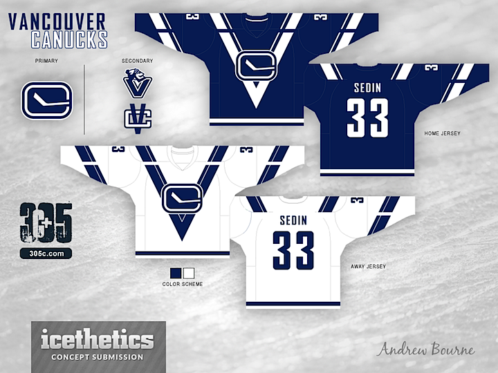
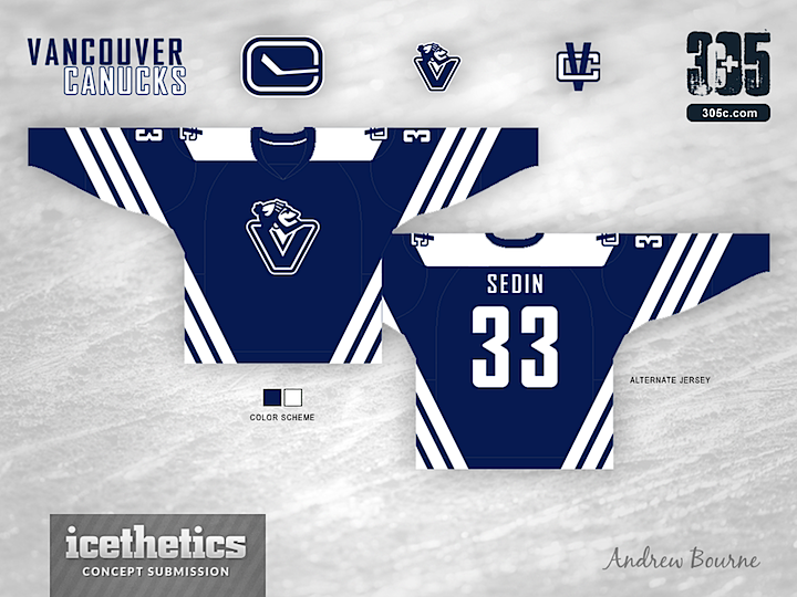
Right away, I condensed the color scheme to two colors. A lot of V's and a lot of colors with make you want to puke. The large striping appears to be cut or broken up to really show that V in the body of the uniform. With that break, you can really see the V and the C work together. The alternate jersey already has a V on the chest so, I made some angled striping along the sleeves and body of the jersey. Why 3 stripes, you ask? Three trips to the Stanley Cup Finals. Would the stripes actually look good on the ice? I'm not sure, but it looks interesting enough on paper - er... computer screen.
 Andrew Bourne
Reader Comments (9)
Great jersey striping ideas, but like Chris said, it's really missing the green. Now they remind me too much of the Lightning, and a lot less like the Canucks.
i would be very interested in seeing the blue replaced with green. look a little bit to maple leafy right now.
I agree Chris, really disappointed that the green has been dropped. As with most of the Bourne rebrands, the jerseys lose colour and feel washed out. It's a decent design concept, but the colours really take away any like of it I might have.
i tend to like most of borne's redesigns but this one does nothing for me. don't we already have enough simple blue and white jerseys with tampa and toronto? do we really need one out west too? i like the "V" designs in the sweater but the color scheme is killing it. if these same sweaters were presented in a nice shade of green and white i could see myself getting behind that.
The home and aways are forgettable, but if you add some green in the thirds are a pretty creative use of the ubiquitous three stripes on jerseys.
Not a bad design, but, 3 stripes for "3 visits" to the Stanley Cup Final? Most teams would pay tribute to the number of cups won, not the number they lost.
I really like the design, especially the second set. However i do have to agree the green needs to come back. Otherwise it's another TML/TBL colour combination and no sane VC fan could ever live with that
It's absolutely asinine to put three stripes on a jersey for three losses in the Cup finals; in fact, it's insulting to the team and their fans. We already have to put up with ribbing from three of our divisional rivals, and this makes it even worse.
Design-wise, losing the green was a terrible terrible idea. I like the old V design, but putting a logo over top doesn't work. I do like the look of the alternate design better, but I don't think the Johnny Canuck V should be a primary crest. The shoulder yoke looks weird and the intertwined VC logo is placed strangely.
Overall, not the best of the Re-Bourne series.
Agreed with everyone. It needs green.