


Wednesday
Feb292012
0011: The Big, Twisted D
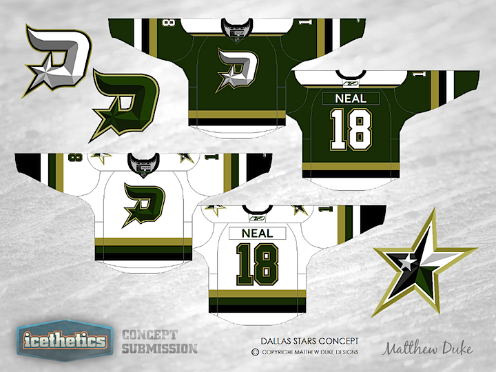
Happy Leap Day! I've always said more green needs to be injected back into the NHL. The Dallas Stars seem like the perfect team to do it at the moment, and if the rumors prove true, they'll be introducing a green third jersey in 2012. Here, Matthew Duke offers up a home-road set marked by a lot of green. His twisted D logo, reminiscent of a boot spur, also happens to be one of the more creative Stars concepts I've seen.
Designed by  Matthew Duke
Matthew Duke 
Reader Comments (18)
I the take on the North Stars jerseys with Dallas' color scheme, but I would switch the primary logo and secondary logo around. Besides that, great sweaters!
I love the concept, but the shading on the D apart from the star adds a bit of awkward bulkiness to the logo. Still cool though and definitely like the green.
Okay, I LOVE this design. Granted, it's just a rehash of the most iconic of all North Stars sweaters (which, IMHO, is not a BAD thing), but the D-Spur is freaking awesome, and I would totally rescind my boycott of Dallas Stars jerseys to buy one if it were put into production. Very tight logo design, with a lot of thought put into it. Far superior to anything they've put out since leaving MN, even the sublimated star jersey they ripped from the ASG. I mean, seriously, anything's better than having some lame-o Dallas wordmark on some mealy-mouthed second-rate Edge piped jersey... Or god forbid, they bring the Mooterus back....
I actually like the secondary logo better. I wonder what it would look like with that on the front.
Minus: Putting Neal's name on there.
Plus: That's a pretty genius logo. Love it.
I don't know if I'd have had the shoulders on the white jersey say green, however that's just me questioning it, I like the design. What I love is the logo's, it offers a nod back to the days back in Minni, whilst also being creative enough to be original. Some have mentioned the shading on it, that can be sorted out. I'd just love Dallas to look at the logo's and ask can we use them please.
This is pretty awesome, and by pretty awesome I mean really awesome. I agree with Zack in that the secondary mark should be the primary (kudos to the designer on both logos, they are really well thought-out and designed). I wouldn't change anything else. Really, really nice job.
another good design.......but, with the stars under new ownership, is it time to move away from green / black / white?? and i also prefer the secondary logo.....
I really like this logo. It's sharp, and represents the brand well. My only complaint would be for the color scheme. I would prefer the North Stars colors, as they are bright and would pop, whereas the jerseys here look a little grungy or dirty.
Great concept though.
The more I look at it, the more I like it. Just anything green really at this point, PLEASE let it be green whatever they do. Or hell, bring back the retro style from when we won the Cup, I know the star pattern won't work on the new EDGE system but the old ones weren't bad at all.
Just get rid of the white shoulder yoke and this jersey's near perfect. Very well done.
On second thought get rid of all white on the dark jersey.
I had a very similar idea to a secondary mark like that: http://wildwing64.deviantart.com/gallery/#/d4m1ppn
Not to say that the artist ripped me off or anything - great minds think alike, after all - but I think his execution of the idea is better than my own. I actually think that would have worked better as the primary logo here, with the D-Star on the shoulders instead. Make the colours less dingy and this would be a fantastic look for the Stars.
@Tyler J - I submitted this concept over a year ago when Neal was still with the team. LOL
@Mark B - I have had this logo designed as far back as 3 years ago, with very minor color adjustments - so yes, I guess great minds do think alike!
To everyone else - Thanks for the kind words and I have actually come up with new variations of this logo(s), 1 with the star as the main crest. I'll submit them here and we will see what happens.
Matthew: If you have revisions, feel free to send them. I'd be happy to update this post. (And sorry for the delay in getting your work on the site.)
No problem, Chris! I love the site and I check regularly for other artists' work. I'll see when I can get it to you, I was just surprised to see my work up there!
Love it! The Starts need to go back to green. The jerseys they have now are just awful.
Pretty solid jersey. If the "D" didn't somewhat remind me of the Detroit Winter Classic jerseys, I'd be sold on it. I LOVE state flag in the Star logo! I'd love to see that make it on a jersey. And in this case, I don't mind the darker color North Star nod...looks better than what they currently wear.
secondary logo is awesome! send that into the stars organization could be the foundation for a worthy rebrand!