Wednesday
Mar282012
0039: A Throwback Third for the Jets
 Wednesday · Mar 28 · 2012 | 9:00 AM PDT
  8 Comments

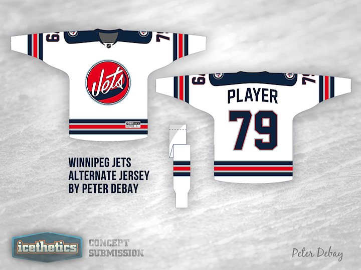
A lot of us are hoping the Winnipeg Jets are considering a third jersey for 2012, if for no other reason than it would mean we'd get to see a new jersey in the NHL this fall. But if it happens, what should it look like? Peter Debay recommends a bit of a throwback. Personally, I like the old logo but I'm worried the striping is too reminiscent of the Rangers. Maybe something close?
Designed by  Peter Debay
 Peter Debay


Reader Comments (8)
I think all thats holding this jersey back from being good is the logo
Every time I look at the logo I think it is saying "Vets"..
I actually really like the logo, I think what's holding back the Jet's is their inability to use different colors (all canadian teams use one of three colors).
Don't really like the logo here, but it's better than having their current shoulder patch being the logo.
Too much like the Rangers away jerseys in my opinion.
Well, the original Jets NHL jersey was, in essence, a Ranger jersey, albeit a failed pajama design that could not have disappeared fast enough
I love these, I think grey instead of light blue would make it better though.
I like this concept, the only change I'd make woutld be to have "Winnipeg" writen in the blue jet "wash" or swoosh, I'd lower the blue swoosh just beloe the Jets word and have a small jet fighter at the tip of the jet wash. I like the use of the original colour scheme.
It would make the chest logo similar to the original Winnipeg Jets logo of WHA vintage.
Anyway, those are my thoughts, would love to see a mock-up like I described.