


Saturday
Mar032012
0014: Vintage White Classic
 9 Comments
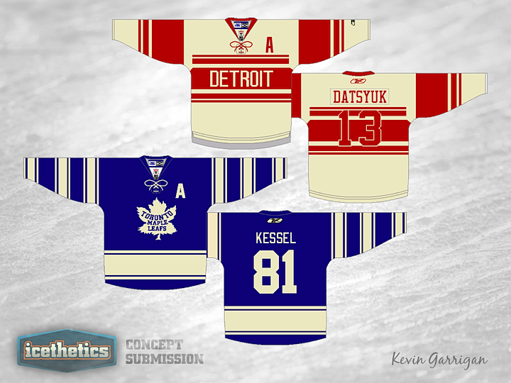
It's another Winter Classic Weekend and today is all about the vintage white, as you can see in Kevin Garrigan's proposal. This one isn't dissimilar from the one posted last Sunday in that its based on uniforms that are nearly a century old. However, Kevin is trying to show the age by using "vintage white." He's also gone with a light jersey for the home team (Detroit) and a dark one for the road club (Toronto).

Reader Comments (9)
With all due respect, too many Leafs/Redwings Winter Classic jerseys.
I actually really like BOTH of these concepts. However, the one thing that I'm seeing could be changed is on Detroit's uniform with the numbers, I would make them into vintage white as well - just so you could see them better!
Ryan: If that's a complaint, I don't understand. It's the Winter Classic... the Red Wings and Maple Leafs are next to play in it. Obviously, most concept artists are focusing on those teams for that reason. That's not to say we won't have any other types of Winter Classic concepts in the weeks to come... but I can only post what's sent to me.
And on a broader note... concept posts every day now and I'm still getting complaints. Really? I have to say, some comments may be better kept to yourself, you know?
Chris, Ryan does not speak for the majority (or any) of the rest of us...we love any and all concepts! He's the guy who complains about getting free money in the commercial Jimmy Fallon is in. Or the 5th dentist who says Trident isn't good for your teeth. In other words, please don't change the postings, and keep Winter Classic Weekends coming! :)
On to the concepts...I'm not opposed to vintage white when it has a reason to be used, and I think it looks good here. I agree with Kevin, though, about Detroit's numbers: if I didn't know what number Datsyuk wore, I still wouldn't know because of the red-on-red. Otherwise, solid jerseys.
Thanks, Drew. Not to worry, nothing's changing here. I'm letting the ratings be my guide and it seems the majority of visitors are enjoying them. Plus I like being able to have something fresh on the site every day. But I just couldn't help but call out the guy complaining about free money, as you put it. Sometimes I don't get it. :)
I still cannot see the appeal of vintage white. Then again, I'm not big on "pre-faded pattern" T-shirts, either. What's wrong with having a retro design without the fake aging? Plus, I just don't like how it actually looks on the players on the ice when it's used in such large doses (particularly, the Rangers' WC unis and the Blue Jackets' alternates).
That said, I do agree with Kevin and Drew on the numbers on the Wings concept. Both the 1991-92 and 2009 WC designs used white outlined in red to make the numbers stand out over the red striping (and the original 1920s versions of those designs had smaller white numbers contained entirely in the wide stripes).
Like both of these, but agree the DET number set should be in the vintage to make it easier to read.
On a side note, I'll take all the free money you want to toss my way.
I love the vintage white look, I think it looks great. However, I don't care for that vintage Leafs logo. I understand that these are throwbacks, and that's how they were, I just really don't care for it. I like the vintage logo they use for their current third jerseys.
BTW, I love this site. I stumbled upon it a couple weeks ago, and have been stopping by at least once a day. Great stuff!
I'd agree with the rest on changing Detroit's numbers to white. Otherwise the only thing i'm uncertain on is the thickness of that waist stripe on the Leafs jersey. Otherwise, very solid.