


Friday
Mar022012
0013: Long Island Freak Out
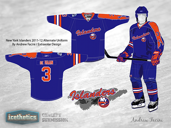
It's Friday and that means two things. First, the weekend is nearly here. And second, Icethetics has concept art that could induce convulsions. Think the New York Islanders' black third jersey is bad? Andrew Facini shows us how much worse it could've been. That's right, how would you like a map of Long Island running the length of your left arm instead?
Designed by  Andrew Facini
Andrew Facini 
Reader Comments (24)
This jersey isn't half bad! Freak Out Friday? This jersey isn't nearly as bad as the real 3rd!
I like it...I might go away from the script 'Islanders' and orange pants. Well done though.
Including map of the Island on the sleeve is a little weird, but other than that its pretty alright and miles better than that Mets/Knicks rip off they have.
I honestly think it's better than the third they have now. However, if they replaced the third with this, this would still be the ugliest in the league.
It wouldn't be terrible if that awful map of LI wasn't getting it's Atlanta Thrasher on down the sleeve.
I wonder if these artists actually intend on their artwork being on Freaky Friday...probably not... Apart from the word mark, which is all the rage these days... I actually don't mind it.
Love these, its a slick look, great color and the 'Arm Island' give a very unique look without looking out of place. The chest logo needs a little tweeking im thinking tho. But Great job.
Glad I'm not the only one who thinks this isn't a freak out concept compared to the Isles actual third haha
What would have really made this shirt freaky, would have been the inclusion of those horrible half stripes around the other arm, much like the ones on the old Oiler shirts. That would have made this shirt just plain freaky ugly. However the concept isn't that bad if I'm honest.
Anything is better than their god awful black third jersey. Now that the Thrasers are gone that is BY FAR the worst jersey in the NHL. Nothing else even comes close.
This is definitely an improvement on the current third. That said, still appropriate for Freak-Out Friday.
You know... it's really funny - because I bet alot of people are thinking to themselves right now: "Oh my God this looks TERRIBLE!!! No wonder he's showing it on Friday!" I actually LOVE IT. Well maybe not, but it's alot better than the current black alternates that the Islanders have. The sleeve pattern with Long Island running down it is an origianl idea, harkening back to the days of "ATLANTA" running down the sleeves of the Thrashers... I actually would LOVE to see the Islanders wear this, and hell: I'd buy one!
Replace the island on the arm with stripes to match the other sleeve, put stripes on the bottom and (maybe?) make the pants orange and you've got a winner. It's incredible how much better these concepts are than the finished product they actually put out there.
well....at least its not black!!!
1) de Haan is a complete S.T.U.D. 2) these are decent. 3) they're still better than their current alternate jerseys.
The sleeves and shoulders would actually make a good scarf.
I actually really like this jersey. I think it would be great to see the Islanders wear these instead of their black alts. (I realize that I'm in the minority here.) The only thing I would change is either going with the logo or the script... Not both.
Two changes I would make: four stripes on the opposite arm, not three. Echo the hash mark shoulder patch, which they never should have gotten rid of. I loved it as a subtle little nod to the dynasty, reminding players and opponents of the history. Like the GSH on the bears uniforms and Tampa's victory stripes, it's a nice little detail.
Second: Add some sort of stripe at the bottom. Either one echoing one of their older designs, or just a single thick orange. Either way.
Other than that, I like it. Unusual and outlandish, but not wholly bad. Not sure it could be manufactured easily, but that doesn't matter here, does it?
Wow, you guys surprise me! I wasn't expecting such positive comments on this once — hence the Friday posting. Though based on the rating, I have to assume this is a case of a loud minority. The rating is way too low for this design to be generally considered good. And most of you know that if the Isles ever came out with something like this, you'd hate it. Don't lie.
Guess now I know you're easily won over by bright colors, regardless of the actual design of a jersey. You can absolutely count on a black jersey for next week's Freak Out Friday.
I agree with Zeus on the sleeve stripes. The three-stripe pattern is too Rangers-like (specifically from the 1978-97 style).
It's a bit out there, but better than most of the early sublimated-print thirds, and definitely better than that black mess they have now. The four-stripes thing would improve it, and there does need to be some form of separation between the jersey and pants; the pajama look didn't work for the Leafs, after all.
Not as bad as their real third.
Haha, nope! My goal here was simply a simple, yet quirky alternate jersey. Mostly as proof that the Islanders could have done better, and for free.
The team loves their hate-able jersey designs, so my thinking here here was to create one in which at least the orange-and-blue remain pristine. Really, other than their primaries, the Isles have a long tradition of "Freaky Friday" uniforms.
When it comes down to this being "good" or not, clearly, it's not. It's a quick, ramshackle design for fun. Still, I'm surprised to see the critical analysis! Loved the scarf idea. I'll gladly accept the 2.5-star rating, seeing as
Chris's favoritethe actual third is at 1.5.Anyway, enjoy, folks. Chris, thanks for featuring my work.
I have to agree with a lot of the other posters here. I really kinda' like this jersey. It's creative and would be a really cool 3rd.
does anyone else think that the shoulder looks like the player vomited on himself and now its dripping down the sleave?