


Wednesday
Mar072012
0018: A Unique All-Star Blend
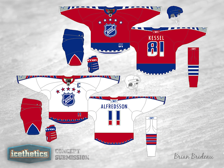
Long time Icethetics concept artist Brian Brideau is always coming up with unique and inventive uniform designs. This one stuck out to me as one among his very best. He's proposing a new set of a NHL All-Star Game uniforms, probably for 2013 and I think they look simply phenomenal. They're a risky blend of the historical and ultra-contemporary. This set even gives a nice nod to the host, the Columbus Blue Jackets, from the red, blue and silver color scheme, right down to the stars on the jersey cuffs. If this were the real thing, I'd be in line for a Stamkos in a heartbeat.
Designed by  Brian Brideau
Brian Brideau 
Reader Comments (10)
Definitely unique and intriguing, but the double coloured numbers seem weird to me. Great job though.
Ahhhh the Preds font minus the guitar strings. NICE! It's time to go back to the old days.
I love it except the little numbers on the front hem. I think it would be perfect without those.
Honestly I think sometimes people just try to create "problems" with the jerseys. The numbers on the front of the current all star jerseys are lame being right above the NHL logo. The league loves to show off the jersey capabilities at the all star game so they look to do all they can, I'd rather they put a number down low, it looks much much better and unique. The chest says classic while the rest is more modern. These are some of the sickest jerseys I've ever seen. 6/5 stars.
I am LOVING these! I'm not completely sold on the multi-colored numbers, but I just love the inspiration from the 1947-59/1992 design.
I'd love to see these rendered on a player model.
LOOVE these designs. The overall look is fantastic... The stripes down the sleeves look great, big fan of that. Also glad to see the arched stars on the chest make a comeback..
However I'm not a fan of the collar on the current jerseys, just looks odd to me.
Great work!
Hands down, THE best All-Start jersey concept I've seen on any site! Really great job, Brian.
The wrong Reebok logo and the Two coloured numbers are whats wrong with this Jersey
Awesome set, I'd love to see a mix of old and new however as many have said, minus the 2-toned numbers. Everything else looks excellent imo.
These look worlds better than what they are using for the All-Star game now! I would buy this!