0687: D.C. in Winter


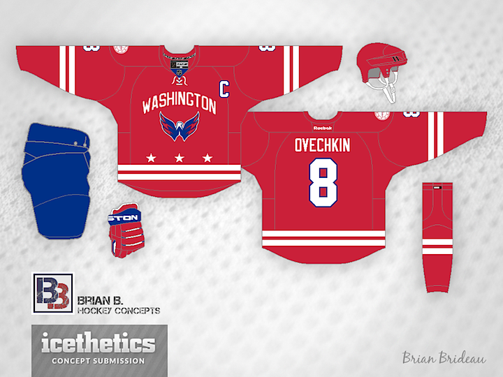
The Washington Capitals will host the next NHL Winter Classic in 2015. But what should they wear when they do? Brian Brideau imagines a uniform inspired by the flag of the District of Columbia.

|
The Washington Capitals will host the next NHL Winter Classic in 2015. But what should they wear when they do? Brian Brideau imagines a uniform inspired by the flag of the District of Columbia.
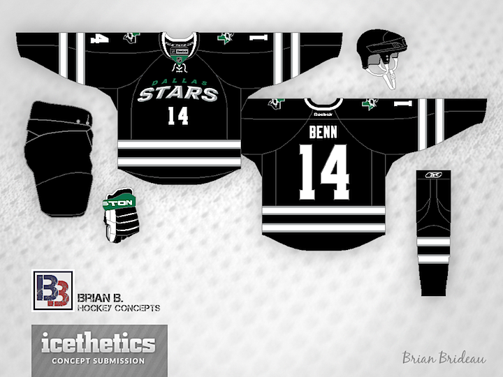
Brian Brideau offers a wordmarked black third jersey for the Stars. Too soon?
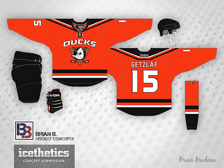
Anaheim Ducks PR man Adam Brady recently confirmed the team will be wearing an orange jersey for their Stadium Series appearance in January. So I've gathered up the top five orange Ducks concepts recently submitted to Icethetics. First up is Brian Brideau. Recognize the inspiration for his design?
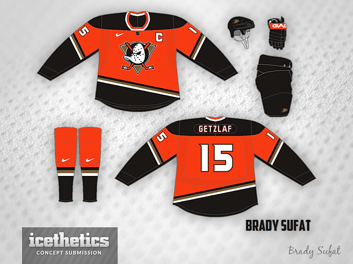
Brady Sufat's design has a bit more black, but with the "Mighty" touches, it makes for a sharp look. Though I wouldn't count on seeing that Nike swoosh anywhere near an NHL game anytime soon.
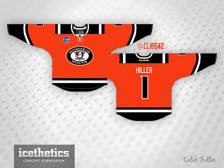
Caleb Fuller has a more retro feel to his orange number with the shoulder patch from the Ducks' third jersey placed front and center.
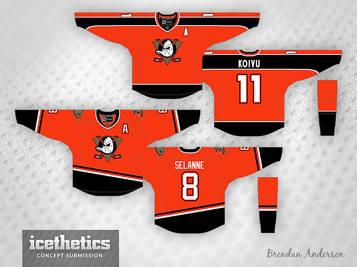
Brendan Anderson has not one but two ideas to share. Both are inspired by jerseys from the eggplant and jade days — only in black and orange. Personally, I prefer the top one.
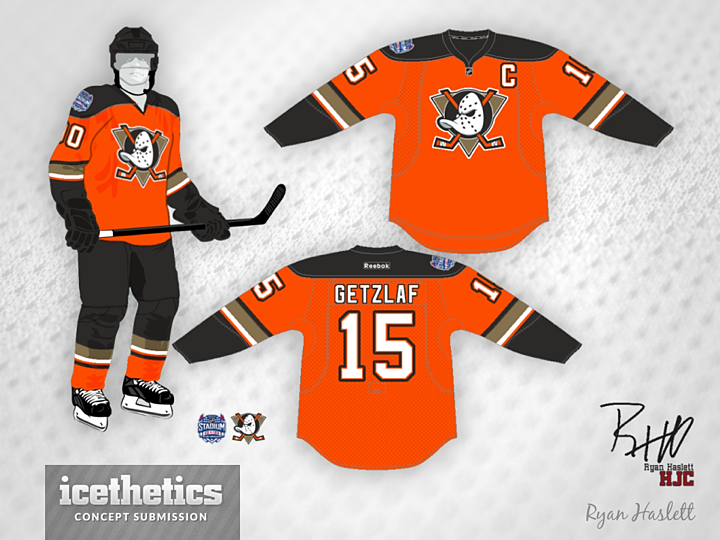
And finally, Ryan Haslett gives us this one without any waist stripes. Got any favorites in the bunch? If the Ducks had to go with one of these six jerseys, which should it be?
I'm really digging this black Islanders concept from Brian Brideau both because of its nod to Brooklyn's hockey history as well as the use of a distinct black and white design. The white sleeves are a welcome feature. Thoughts? (Apart from how much I've been posting Brian's work lately!)
It's Sunday and that brings another Islanders concept. How about this one from Brendan Nashman inspired by the old New York Americans? And since today is unveiling day for the Calgary Flames' third jersey...
...I had to sneak this one in from Brian Brideau. He took the leaked shoulder patch and created an entire uniform design around it. I think it's actually really cool. What about you? Better or worse than the actual jersey they're unveiling today?
In this week of featuring some of Icethetics' most prolific concept designers, we come to an artists who's been submitting work to the site for as long as I can remember. And he's always thinking outside the box. First up, he's got a Flyers concept inspired by the first third jersey of their in-state rival, the Penguins.
After the Coyotes unveiled their third jersey in 2008, they posted some of the unused logo designs that were considered. Brian borrows one of those logos for his Phoenix concept.
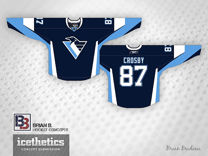
Finally, it's not the first time we've seen the Penguins in blue, and it almost surely won't be the last. But with the '90s logo? That's a bit out of place. But it makes for a very cool (pun!) sweater design.
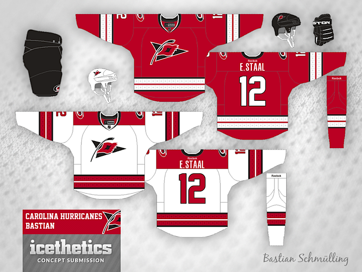
Few were impressed by the Carolina Hurricanes' new uniforms this summer. So a couple of our regular contributors to the Concepts page sent in what they thought would be great improvements. Brian Brideau rounds off the shoulder yoke of the white jersey and adds the storm flags back to both.
Meanwhile, Bastian Schmülling has a different solution. If the Canes just wanted more classic striping, why not make the storm flags a little more subtle? I'd say that would've been better than removing them entirely. Which of the two designs do you prefer?