Monday
Apr162012
0058: The Bruins at 90
 Monday · Apr 16 · 2012 | 9:00 AM PDT
  8 Comments

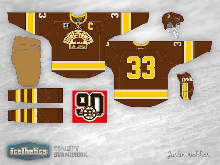
Two years from now, the Boston Bruins will be celebrating their 90th anniversary. Justin Nahhas has taken the bold step of creating an anniversary jersey for the occasion. And it's definitely a winner in my book!
Designed by  Justin Nahhas
 Justin Nahhas


Reader Comments (8)
I'm sure the brown is inevitable... but ugh. Not a good look. I like the design, but not so much the brown.
As a die hard Boston Bruins fan, I am backing this concept 100%. Could someone provide more information to myself or the designer of this spectacular uniform as to how the collaboration process between the Ottawa Senators and Icethetics designer Jacob Barrette began? I think this would be a perfect replacement to the otherwise bland personality-lacking alternate sweater the Bruins are currently wearing, and would be a wonderful way to mark a monumental anniversary in Bruins history. (The only minor tweak I might suggest is switching to a primarily gold sock going back to the tradition that we strayed from with the aforementioned alternate uniforms.) FANTASTIC WORK JUSTIN! A+
While I love the concept of bringing back the brown from the olden days of Bruin hockey, wouldn't it be even cooler to see some beautiful yellow throwbacks from the early 1950's? The 2010 Winter Classic Jerseys were a start, but the true jerseys of the '50's, myriad stripes and all, would be a great way to celebrate 90 years of hockey in Beantown. That being said, I love the use of the 1920's and '30's logo and the color scheme.
Looks like a smushed Cadbury egg to me. Not a fan.
Thanks for the feedback guys.
The reason I didn't put those yellow socks that we've come accustomed to is because it just didn't work as well as I would have hoped it would. I guess I had to give up tradition and make the socks brown simply for aesthetic purposes. The reason I didn't make this jersey yellow was because it was already done. As a concept I wanted to make my design as original as it could be, and if that meant pulling out a colour like brown that resembles a smashed cadbury egg, well then so be it. I was extremely happy with the way this turned out and I appreciate the feedback, both positive and negative. Especially Aarons's, means a lot for a fan of the team to be that impressed with my work
And KZED, I challenge you to make an anniversary jersey for the Bruins and submit it to Chris. Its funny, I really like Cadbury cream eggs...
@KZED- Don't the Bruins always look like smushed Cadbury Eggs? I mean, after all, they ARE the Bruins, they always get smushed by my team.
I've given this some thought now.
First, let me say that I absolutely love it, but my immediate reaction was that it's missing something. I think this jersey is just a little bit too brown, and a gold shoulder yoke would offset that perfectly. Obviously the collar would have to be either brown, or brown with with a gold top.
This is still one of my favourite concepts! Hopefully the Bruins take note.
I love this. My favorite Bruins jersey I've seen! Justin did really well this time around, I really wish we could see some more of his work. I want to see what he has to offer.