Sunday
Apr082012
0050: Winter in New York
 Sunday · Apr 8 · 2012 | 9:00 AM PDT
  12 Comments

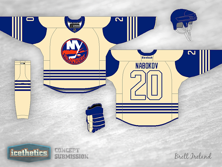
This half of the Winter Classic Weekend is focusing on New York. It's fair to say there are a good number of fans hoping to see the Rangers and Islanders face off in the elements. We've seen lots of examples for the Rangers, but what about the Isles? Brett Ireland provides us with a very simplistic yet intriguing solution. The only thing that probably wouldn't work — since this is a TV event, after all — is the lack of contrast on the back numbers. And while the design doesn't exactly scream Islanders, it would probably fit the Winter Classic theme.
Update on Monday · Apr 9 · 2012 | 2:40 AM PDT by
 Chris
Chris
 Chris
Chris

After reading through the comments, Brett decided to take another swing. This one includes the Isles' other important color — orange.
Designed by  Brett Ireland
 Brett Ireland


Reader Comments (12)
I think everyone is in agreement that if the Islanders were ever involved in a Winter Classic, they should wear a modernised Fishsticks jersey. Simply no other way for the club to go to, they already use throwback-esque jerseys and there isn't exactly much more jersey design history to lean back on! Never gonna happen though (the fishsticks jersey, not the WC game)
Just gotta fix the large numbers so they don't blend in so much.
Maybe make them orange?
I love the cream color... however I don't think it works with the islanders, needs some orange.
Add some Islander Orange to the numbers and vintage up the "ny"
I'd wanna see Devils-Rangers instead...Devils wearing white versions of their St. Patrick's Day jerseys and Rangers wearing their '94-style jerseys
A thicker outline on the numbers (like the Flyers use) would help the numbers, though orange numbers would help more.
Just make the base color, orange, and it's perfect. And I guess the stripes on the bottom signifies the four cups the Isles won in the 80s, I'm an Islander season ticket holder (and a huge fan).
Unfortunately for me, there isn't enough to say this is an Islander jersey. We have a fan base that all we care about is tradition (and firing Terry Goldstein).
I like the one on top much better than the bottom. I think it has to do with the orange being all broken up on bottom.
Being an Islanders fan myself I actually wouldn't mind it. I think it would be better than what they would actually come up with. Small suggestion, make it white. I don't hate the cream, but lets face it, the only reason these teams wear cream is that when they look in the teams jersey history with photos, they were black and white photos which made them look cream, they weren't actually cream though. They go for the classic look but what really makes a classic is just a great jersey. Anyway great job with this, if they were to use something like this I'd love it. Also IMO I like the second concept better because you added the orange. Great job on both.
I don't like the update, I prefer the original.. Perhaps the Numbers could have been oragne instead of white.
The original was sharp, different and very clean. I know it reminded me of a soccer shirt at first, but the more and more I look at it the more and more I like it. It's just not the normal hockey shirt.
The new version, meh it's just another Islanders design, nothing special. I don't want to sound disrespectful or anything, but it's got too much orange in for me, it takes away the clean feel of the original. Whist thinking about it, perhaps orange shorts in addition to the numbers would be suffice for our Islander supporting fans? I don't know.
Personally, I like the sweater with less color, nice simple lines!
Thanks for the comments. I originally designed it simple like that for that very reason. I couldn't find an appropriate amount of orange apparently, ha. With the one color the 4 lines signifying the consecutive Cups were the stand out feature and the design was efficient and simple. When I tried to add a decent amount of orange the lines kind of got lost in the design.
I thought about adding orange to the numbers, but felt that I would break the simplicity.
~Brett