Monday
Apr092012
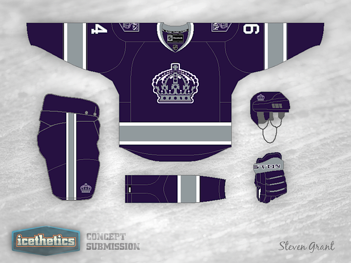
0051: King of All Kings Concepts
 Monday · Apr 9 · 2012 | 9:00 AM PDT
  19 Comments

I"m not sure why, but I've been receiving a lot of Los Angeles Kings concepts lately. This one by Steven Grant stands out because I could actually see it being worn on NHL ice. It's a throwback inasmuch as the Flyers' 2012 Winter Classic jersey was a throwback. It borrows elements from the club's history while creating a whole new look with purple and silver. I really do love this. I'm no Kings fan, but this is one jersey I could see adding to my small collection.
Designed by  Steven Grant
 Steven Grant


Reader Comments (19)
Really like this one. In my opinion, just a thin stripe of black along the waist and sleeve stripes would take this to another level.
I agree with you 100%. Really nice work.
Plus the "able to pull off purple" is the most difficult trick in design and Steven somehow did it.
Kudos!
As a die-hard Kings fan, I for one would love to see them go back to the old Crown logo. In my opinion its the only truly good logo the Kings have ever had. No more Chevy, Burger King, homeplate or whatever that weird angular crown they've worn recently was... This is a great example of how good the original can look. I love the classic 'Forum Blue' and gold myself, but this jersey looks great.
BTW - For those who don't already know this - the Kings had the purple and gold before the Lakers, not the other way around. Google it. GKG!
Absolutely. LOVE. This. Jersey. A great cross between purple and gold and black and silver, which is probably what the team should have done this offseason. Really a great job.
We have a habit of stealing Kings jerseys, and I'd love to see this be the base for an Olympiques alternate jersey! Love it!
very hot. i want to say grant should add some black or even some gold in the detailing but that'd surely be a mistake.
the most likely reason you've gotten so many kings redesigns is because they're current uniforms are so very, very dull. grant's design shows that simple and basic doesn't have to be dull. being just purple and a neutral silver with a little white detail, this concept is just as powerful as anything more elaborate.
Veddy noice. Could use some yellow though. Then it would look simply sexual!
Pretty good. I really wish the kings would use more purple, it's unique, clean, and looks good.
I'm in the "add black to the striping and I'd put down money for it" boat. Love the design.
LOVE the old Crown logo! i think its the best logo in the NHL and wish they would bring it back.
love the purple, also would like to see a bit of the gold come back
I'd love to see the white road version of this concept!
As an original Kings fan circa 67 I will never understand getting rid of that crown logo...it's stylish, identifiable, and speaks to the team's tradition. The updated look with purple and silver is perfect. Why is it that "professionals" can't come up with something like this instead of hmmm...I know, black and white.
This is a really good mockup. I'm not a huge fan of the current jerseys (I hate the away's) but I'm partial to the Gretzky-era sweaters. Those (yes, even with the Chevy logo) are awesome. I know I'm in the minority with my fellow Kings fans.
That said, this is pretty sweet. I don't see the organization embracing purple again. I'd love to see the away version of this jersey (just, please don't make it yellow!). If we ever make the Winter Classic, this is a concept I'd love to see.
This is really good-looking and weds two past uniforms with some modernity. Really sharp uniform.
AWESOME...love it. Send it to the Kings offices
I really do like it i think it does need a little black but not to much and btw great name( mines Stephen Grant)
I never knew purple and silver went so well together.
Looks like one of those female versions of jerseys that you can get in the official team stores. I hate it. This coming from a die-hard Kings fan.
Late to the game, but thinking what if a metallic gold, not yellow gold was swapped in for the silver? Or perhaps keep the sweater as is, but incorporate black pants and possibly a black helmet?