Sunday
May272012
0099: Two Ways to Use the Tomahawks
 Sunday · May 27 · 2012 | 9:00 AM PDT
  4 Comments

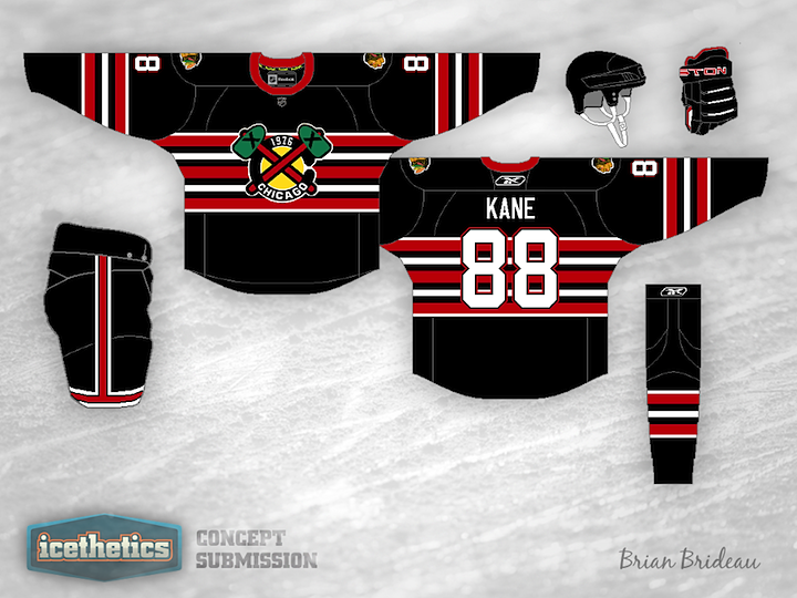
Today we're looking at some alternate jersey alternatives for the Chicago Blackhawks — both centered around the club's tomahawk-laden secondary logo. Brian Brideau's design actually doesn't use that logo directly, but rather a modified version that features the year of the team's founding. It could work great for a future Winter Classic what with the abundance of old-timey stripes and all.

Justin Wiltron's attempt is much simpler and to the point. Make it black and put the actual tomahawk logo on the front. Why hasn't this been done yet? It doesn't look bad at all. In fact, as Blackhawks jerseys go, I kind of like this one.
Designed by  Brian Brideau&
  Justin Wiltron
 Brian Brideau&
  Justin Wiltron


Reader Comments (4)
On Brian's, does that say 1976 or 1926 (or do you mean 1986 when they changed thier name from Black Hawks to Blackhawks)?
When I first saw Brian's jersey design, I wondered why the front logo had "1976" in it (I wasn't sure what the significance was to the Blackhawks franchise). As an Atlanta native and a long-time fan of the Braves, I figured it out...
http://www.sportslogos.net/logo.php?id=bmgndhhvp8d9dllfh3vnf8g5u
The Wiltron isn't very blackhawk-like due to the shoulder yoke but i think it looks great. On the Brideau, if you took those chest stripes down to the waist and removed a few, this would be spectacular. Cookie cutter style, but spectacular. The barbershop chest is a nice idea though. These would both make such cool logos. They should really consider using the tomahawks for a third.
Me being from Illinois, I know that it is hard to mess with the Blackhawks logo. That's why I like the second one you made because it uses the secondary logo that has been in use for a while.