


Tuesday
Jun122012
0115: The Stars of America's Capital
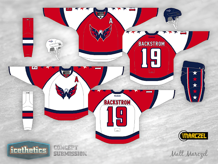
Another double feature on this Tuesday! Stars Week wouldn't be complete without a stop in America's capital city. In his Washington Capitals concept, Matt Marczel hasn't just added stars to the jerseys, he's added them to the logo as well. Look at these and tell me that "Weagle" logo doesn't belong on the front of a uniform. Granted, the stars may be a bit much.

We have another prolific artist in Colin May who thinks the Caps jerseys need more stars. I find myself oddly enjoying the shoulder yoke on this one. You wouldn't think I'd like it that much in this context, but somehow it works. Got a favorite between these two?
Designed by  Colin May& Matt Marczel
Colin May& Matt Marczel 

Reader Comments (5)
The one from Marczel is amazing. I don't think I have ever seen a concept quite like his. Now if he would only make a blue version........
I like the use of the actual logo
I'm not crazy about either, but I definitely think that Colin's is pretty nice. The shoulder yoke brings to mind the 1992 All Star jerseys (in a good way), and I like that.
I really love the concept at the top by Matt M. Would be an awesome look for the Caps.
I love Matt's white uniform, but the stars on the logo look more like rivets than stars. Either way, not necessary. Having the weagle on a white jersey is extra effective, as the negative space of the Capitol building is white.
I don't think the red jersey and the weagle are a great fit - a blue jersey would be more powerful. Even then, I think the white one would trump it, for the reason about the color of the building.
I find Colin's to be a little too busy. The striped shoulders are neat, and I like the trim/sleeves, but not together. AS well, I feel like the logo on the front should be a bit larger.
Still, all three of the jerseys just go to show that the weagle needs to be at least on a third jersey. It's such a great design; it's wasted as a shoulder patch.