Thursday
Jun142012
0117: The Stars of Dallas
 Thursday · Jun 14 · 2012 | 9:00 AM PDT
  24 Comments

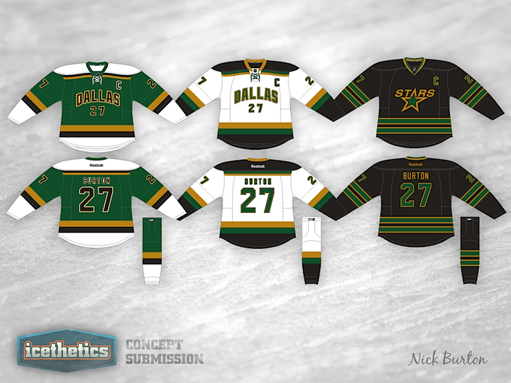
The Dallas Stars are the obvious final stop for Stars Week. Nick Burton's redesign is very much inspired by the old Minnesota North Stars. Seriously, is there anyone here that doesn't like this one? Great work!
Designed by  Nick Burton
 Nick Burton


Reader Comments (24)
I'm curious as to what the Home and Away would look like with the logo from the Alt.
I think the colours are great, but I'm super disappointed to see the DALLAS on the front, instead of the logo on all 3.
the basic jersey design is ok, but please stop with the word-mark!! cant someone give the stars a decent looking logo??
Loving the jerseys. Would love to see Dallas in those uniforms in the near future. :)
Better then the current scheme but still not a fan of the Word and number combo rather then the logo. The alternate is sweet.
I for one would be. Colors, simple striping, and fonts are great. DALLAS is never great. I cannot wait until the NHL realizes how silly the city name word mark looks on a hockey jersey, but call me old school.
I like the colors and design of the jersey, but I hate that plain "Dallas" across the front. The logo on the third jersey isn't too bad and the Stars would be well served if they went back to using it full time
Pretty good. Personally, I would put logos on the home and road shirts and change the number colours on the home and 3rd as well as the name colour on the home so that they looks more legible. Other than that, you've done a good job.
I think they would look much better with the Star logo on the front instead of the word Dallas. Other than that I like the home and road jerseys. I will never like black third jerseys though.
Love it! Only things I would fix are names/ numbers on the green jersey and make them white with black and gold outline instead (no outline for name)
Honesty, I'm fine with the jerseys, but not the home and road socks. I like the top and bottom of home socks to be colored, and the tops and bottoms of road socks to be white, but I'm not as concerned about the roads as I am the homes.
I say swap the black/white on the green one and the black/green on the white one and we should submit it to the Stars!
Love the color, but please no more words/numbers on the front. Put the logo on the front of all three jerseys and you have a real winner.
The black 3rd is phenomenal. Would love to see that as the Stars home jersey.
As a longtime Stars fan, I can only dream that they'll wear something like this in the near future. This jersey is the perfect blend of colors from their history with the more "modern" black design.
Awesome concept, only thing would be throw a logo on the jerseys instead of the script.
The Dallas Stars are not the North Stars. Try something original.
Great attempt but as much as I would love to see the stars adopt more green and gold, I'd love to see less black and more of a kelly green being used and with less emphasis on the Dallas word mark and more use of the should patch Texas map logo they have.
These are better than the current Dallas uniforms, but I'm still not a fan. The white jersey is clean and appealing, but the green just looks a little goofy to me. Plus it reminds me of the jerseys from the first Mighty Ducks movie.
Great concept, I think the stars are in need of a logo update in general though. I mean, even they barely use it now.
Get a logo but something new and fresh something that says "stars" without actually having the word stars on it
the name and numbering on the green one is illegible.
Swap the black for white and maybe it'll look better
Get rid of the numbers below the DALLAS wordmark, and I'm sold.
I would like to see the black one as their prime home jerseys. simple, slick and just great!!! GruZZ Booze