0129: Inspired by the RCAF Flyers
 Tuesday · Jun 26 · 2012 | 9:00 AM PDT
  9 Comments

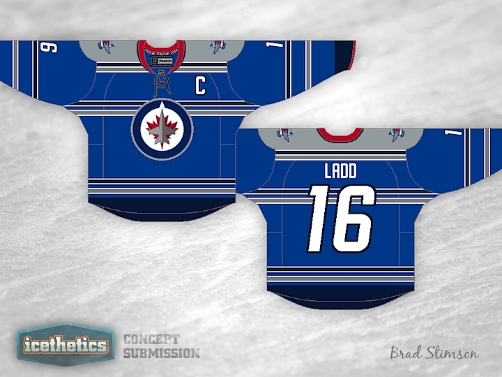
The Winnipeg Jets probably won't be introducing a third jersey in 2012, but it can't be too many years off when there's big money to be made. So Brad Stimson came up with a design concept he'd like to see put into use. Here's what he says about it:
Like others online, I took inspiration from the RCAF Flyers jersey from 1948, no NHL team uses anything quite like it.. So I would love to see something like this worn by the Jets 2.0.
True North is obviously not using too much red, but I felt it should be included in some way, so I kept the amount of red to a minimum. All colours are from their current scheme and I like the Jets number and letter font, so I stuck with it. I think a jersey like this would be a realistic option for them, and I would love to see if Icethetics readers agree with me at all.
So... do you?
 Brad Stimson


Reader Comments (9)
Overall it's not a bad concept. I like the stripes and the colour incorporation into them. It's a very unique idea and I think anyone who purchased it would love that kind of detail when wearing it, though the overall effect might be lost on T.V. The red trim on the cuffs is very sharp and I feel that it would also be complimentary on the hem of the jersey. But onto what I would change, I'm not a fan of the yokes on this jersey or maybe its just the way that it looks with the red collar. My thoughts, and I'm sure there will be mixed emotion on this, is that it may look better with the red hem and navy collar. That or I'd consider a white trim on the yokes, though that may flood the jersey with more stripes than necessary. All in all I think it's a very cool idea and a really good jumping point to create a very nice sweater that would really make this hockey club and brand even more identifiable.
I'm really digging the colour scheme on the jersey. I think the light blue body and grey shoulders go well together, with the dark blue nicely added as the trim colour. But I can't say I'm a fan of the striping across the chest and back... makes the jersey a little too busy for my liking. But overall, a solid effort.
Jets merchandise office, buy this design and make this the Jets 3rd jersey NOW!!!!! REALLY like that design, cant think of anything i would change at all.
Holy crap, Brad...I LOVE IT! My favourite concept I've ever seen on this site. Seriously, forward that to True North, stat! That's a very original look and works great with the Jets' colours. The red collar is a really nice touch.
I'd lose the stripes around mid-torso, otherwise it's pretty good.
If they did make a third jersey wouldn't they use a different logo instead of that one? I would love to see a retro twist instead. Overall, the colors are prime and the striping is unique.
The stripes might be too thin to translate well on tv, but I like it!
Originally I didn't like the middle striping, but as I looked at it more and imagined it in action, it grew on me. Very good design.
I'm surprised it took until the sixth comment for someone to bring up "retro" but if you guys really want retro jets, we can always ask someone to design a Thrashers inspired alt. because that is retro jets