


Sunday
Jun032012
0106: Lady Liberty Liberated
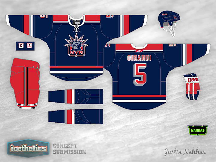
Anyone else been missing the Rangers' Lady Liberty logo? Justin Nahhas created this look, which I think is even better than the original uniform from the mid-90s.
Update on Tuesday · Jun 5 · 2012 | 10:32 AM PDT by
 Chris
Chris
Chris

Justin went back and made some updates to his Rangers concept, adding a white version. Maybe it's just me, but this needs to be New York's regular home and road jersey. There's nothing better.
Designed by Justin Nahhas
Justin Nahhas 
Reader Comments (9)
Pure Awesomeness the only thing that needs to be changed is the Reebok logo on the back
Great design. Only critique I have would be to maybe keep the stripes the same through out the uniform. Change the socks to match the sleeves and possibly the bottom of the jersey and you got a winner.
Yes please, I miss the Liberty jerseys so much. I'd love to see a white version of this as well.
Overall it looks great. The only two things I'm uneasy about are the use of grey striping, and the striping at the bottom. Maybe leave the grey out and make the stripes on bottom thicker? Regardless it looks great though.
I like this concept, but there are too many striping ideas going on here. the stripes on the arms are different from the hem stripes, and different still from the sock stripes. I am also getting two different overall vibes from the stripes. the shoulder yoke and hem stripes seem like the rangers WC jerseys, while the socks and sleeves seem to be straight from the 90s. A consistent happy medium would be ideal.
I know I can't speak for all Ranger fans, but I am a huge Ranger fan who remembers the days of the liberty jerseys. I thought they were nice... for any other team! Cool design, cool colors, but I think most Ranger fans are in love with their home, aways, and heritage jerseys (which I guess is a full blown third jersey now). I know neutral fans like the liberty jerseys, but leave it to the people who watch this team 82 times a year. All Ranger fans I know are in love with the 3 they have now and don't see the need to bring back a jersey that makes an original 6 team look like a Sun Belt expansion team.
I'm a huge Rangers fan, and as far as this replacing their home and road set....You're insane.
A Lady Liberty third would be fine with me, mostly because it would give me an excuse to buy another Callahan jersey, but the Rangers should NEVER replace the diagonal text as home and road again.
I don't like the Rangers (and that's an understatement), but I have always loved the Lady Liberty jerseys. As much as I think that these would make excellent home and aways for the blueshirts...they shouldn't be. I would love for these to both be alternates for New York, but I don't think the NYR can have a home/away other than what the Rangers currently wear.
Thanks for the positive feedback everybody! As far as comparing these to the Rangers current home and away jerseys, I will be the first to say that they would never be able to take their place; nor would I want them to. Then again, that's what this page is for right? Designing jerseys we wouldn't otherwise see happen.
I had fun making these and I love the positive feedback. Thank again.