Saturday
Jun302012
0133: Saber-Toothed Predators
 Saturday · Jun 30 · 2012 | 9:00 AM PDT
  7 Comments

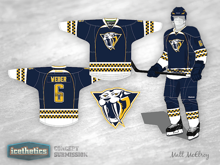
We're probably not getting any new third jersey this fall, but that's not going to stop our concept artists from proving why we should be. Matt McElroy has a blue option for the Nashville Predators and it's a pretty solid look, if you ask me. Now I'm asking you. Thoughts?
Designed by  Matt McElroy
 Matt McElroy


Reader Comments (7)
I don't like how that version of the 3-D Pred Head looks...it looks like it has two fangs and no teeth. If you put the current Pred Head that is on the Home/Away on this jersey, it would be an improvement. I like the look...but I don't think there's enough gold in the overall uniform to go with the way they are promoting the team (the fans have always loved the gold). It's inevitable that they'll get a blue alternate...I just think that there will be more gold in it than in this concept. Very solid concept, though.
Needs more yellow! Let's see this with some yellow pants!
No. All of the checker-patterning on the jersey makes them look like Nashville-themed crash test dummies.
I completely agree with what KG said.
I kinda like the direction this goes in, but the bands make it look like they're sponsored by Checkered Cab..
I think this jersey looks pretty cool! It's different, so I love that our artist went in that direction. However, I noticed that he used two different types of reebok egde jersey cuts, in one. It sort of looks off because of that, but the overall design I think looks good.
Jersey is good and original. Can't get behind the logo though. The thing's jaw looks like it's been unhinged....