


Tuesday
Jun052012
0108: Bolts of Electricity
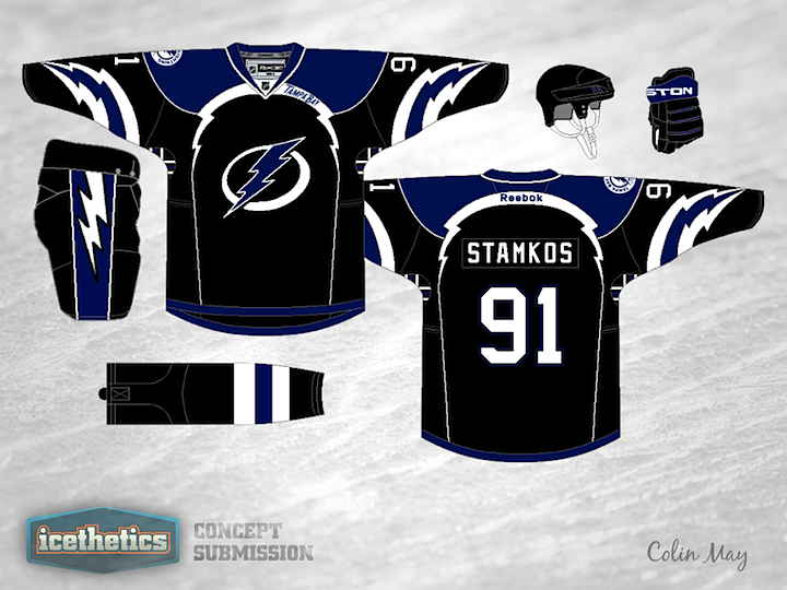
It's my birthday and I'm celebrating with a Tampa Bay Lightning concept! You must be so surprised. This design is a little out there but I wouldn't mind it as an alternate. There certainly are a lot of lightning bolts all over it. Think it's too much? Or does it work?
Designed by  Colin May
Colin May 
Reader Comments (23)
It's a little out there, but I say change the white to pink and make it a Breast Cancer Awareness "Shirt Off My Back" promotion!
Chris, Happy Birthday! The concept is a little minor league, but it's fun.
The lightning-piping on the chest works incredibly well. That little detail makes the whole concept. The sleeve bolts not so mch...
I HATE black based jerseys, but this works. I like it much better than the Lightning's current jerseys.
The bolts on the front and back might be a couple of bolts too many, but otherwise it looks pretty sharp.
I really like this shirt, it has a slight European feel to it, and it also reminds me of an old rugby shirt my local team played in. The bolts on the sleeves did it. I like the subtle Tampa Bay as well, if you are going to have word marks this is how to do it.
This isn't a design that shouldn't grab me, but it does for some reason. It shouldn't work, but it does.
I like that fact that the designer but the team name near the spot the Predators were contemplating putting their location. It was a unique element that got the ax in the end.
The sleeves may be a little too busy with the stripes in the armpits. Wonder what the sleeves would look like if the white bolts were eliminated, the blue bolt on the sleeves was turned to white and the rest of the sleeve to the wrist blue.
It is out there, but I' all for pushing the boundaries a little. A lot of the jerseys are looking homogenized. Happy Birthday!
Lightning at its core is almost always white, if there are other colours they appear on the edges of the lightning, i.e. the interior will always be brighter than the exterior of lightning. As well, the combination of a jagged bolt and a smooth arc makes no sense (on the arms) -- if the lightning could arch that smoothly, it wouldn't be jagged. While the jagged lightning bolt itself is not a true representation of lightning, the versions in this concept take it a little too far from reality for my tastes. As well, it is simply too dark.
That is friggin sweet. I am not even a Lightning fan and I would buy one. Great jersey.
As a diehard Tampa Bay fan, resident of Naples, Blades fan, etc... I have to say, this is awful. I'm the first to champion a new black jersey, in fact I was against switching to blue in the first place. But this is a few too man Lightning bolts. And for goodness sake, can no one find a better logo anywhere? I agree with the above comment though, the extra bolts would make this a nice cancer awareness jersey.
This is way out there, but with some modifications this could be unique an a winner, imo. The lightning bolt striping on the arms is just too much, but I love the lightning-esque pattern for the piping around the chest. Ditch the random "Tampa Bay" text on the piping, too, and this would make a great alternate in real life, not just as a concept.
thats a great 3rd jersey, the only one change i'd make is to lose the little 'tampa bay'.
Not huge on the lightning bolt arm striping
Liking the multi coloured logo though
I like it, if nothing else it's different and unique, and I think it's better than the ones they currently wear
wow
Tweak the arms IMO. Either lose those bolts or make those ones go all the way to the bottom of the jersey. While the Nashville Teeth ones go away.
It is good, a little work and it would be an epic third.
Wow. Looks like ''freak out Friday'' came early this week.
Wow, that's pretty intense. I like the shoulder yolk and piping a la St. Louis' current jersey
The colouring of the logo is the only thing I'd change: blue in the background or in the outline, instead of in the bolt.
I like having black back to Tampa. Even though it is a bit overboard, I still like it. It is cool how you still have the 'victory stripes' in the logo
This is by no means a perfect design, but there are so many cool ideas in here that I call it a winner. Love the "flowaround" Lightning piping with the embedded Tampa Bay, love the multi color logo concept, but with the numbers/names carried the same theme. The Bolts on the sleeves may need to be muted, but I want to see the shirt on a person to see how crazy it looks on the ice, I think it will look like a V from the side and that might look goofy. I hate black for a jersey unless you are the Raiders, but this is almost tolerable. I would love to see this concept in a blue with the black or silver as the accent...
Very cool! There's a lot going on but it's really nice. Maybe make the shoulder a little smaller and make the sleeves a little simpler. Other than that the lighting/piping is sharp and the whole thing is very creative.