


0144: Sabres Re-Bourne
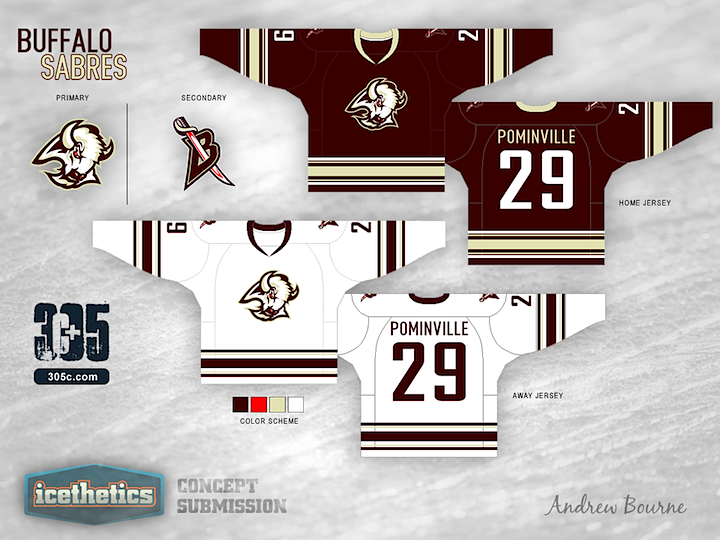
Andrew Bourne's recurring series marks another installment here with the Buffalo Sabres. I'll admit, even I'm a bit skeptical on this one, but I'm curious to see the feedback it gets.

Although my reasoning for The 305cHL Buffalo color scheme might be laughable, at least I have a reason. I decided to ditch the blue and yellow from Buffalo because there is a blue epidemic in the NHL right now: teams with no blue in their color scheme are finding ways to use it in their 3rd jersey. So, one less blue team certainly wouldn't hurt. I believe that the team was onto something during their 'red and black era'. They looked intimidating. What I didn't like was the brightness of the red with the high contrast of the black.
I kept the bright red as a very small accent color and brought in a burgundy to replace the black. The change from yellow to light gold was to hint at the sabre and gives a regal element to the design. Finally, the laughable part: Buffalo can never escape from what they are known for. Yep, that's right, Buffalo Wings. No, I didn't want this team to literally be a buffalo wing with orange, red and brown swirls of color, but I did keep in mind that this is what Buffalo is known for. So, I kept the colors warm (red and gold) and tried to hint - if only slightly - to the big Buffalo claim-to-fame... Laugh now or forever hold your peace.
 Andrew Bourne
Reader Comments (24)
I LOVE LOVE LOVE the color scheme! I know the Buffalo fans are into the blue and gold, but I agree that there are now wayyyy too many blue teams in the league. Blue is the new black unfortunately. So I really enjoy the use of burgundy as the primary color, with bright red and light gold as the accents. Well done! As for the jersey templates and use of the mid-late 90s era logo, I'd like to see more of the sabre element utilized. Great job otherwise! I firmly believe that one of the NHL teams should adopt this EXACT color scheme!
Of the 2 options, I like the top one better, although the road jersey may be a bit too close to the Coyotes' look. I like the colour scheme, however I think it would look even better to drop the bright red altogether.
You know what? I don't think it's all that bad. The first set is the stronger of the two, and the colors work pretty well. Nice Job!
I like! Not as keen on the alternate, but the home and away look great
That burgundy looks straight-up brown, which is groce. Fail logic. Design itself is nice, though. Miss the laces on the collar, but can't go wrong with the sleeve and torso stripes.
I don't mind it. I liked it more before I read the reasoning. I just thought this was a nice colour choice of something different. I get a Hershey Bears vibe from it. I like the last design quite a bit as I agree with the comment that their jerseys were tough looking with the red and black. Nice work Andrew.
I like the concept of the sword stripes on the third but those numbers need contrast. The light gold also looks more like vintage white. I'd rather have blue ubiquitous in the league rather than vintage white.
That is a poor attempt. I understand your logic, but the fans in Buffalo have been craving the blue and yellow. I read your blog (305c.com) and you said if a team has a current jersey better than your concept you would leave it alone, in my opinion you didn't do that here.
At first my reaction to the burgundy made me cringe. But I must say I kind of like the white jersey with horizontal waist stripes even though it makes me think LA Kings and the gold penguins. I'm a Sabres fan and must say I really hated the goat head logo at first but it grew on me over time (4 runs to the Conf. Finals and beyond in 10 years will do that). Make it red and black with those stripes and I could get on board with it as a third jersey. The primary home and away though must remain as they are today (possibly with a patch on the shoulder yoke).
As to the blue epidemic in the NHL I'm not sure it exists. The Sabres are a blue team. They always should have been. So they have more right to it than Florida I must say. Also those are third jerseys and we can only assume they will be gone soon. If there has to be a run on a certain color, why not blue? It's better than the late 90's early aughts run on black. Need I remind you that in '06 the final 4 teams in the East were all in red and black? That was one of the prime arguments for the Sabres going back to blue and gold.
I despise the buffalo head logo. They are called the sabres. They should have a logo that involves swords. If they wanted to use the buffalo head as their logo, they should rename the team the Buffalo Buffalos or the Buffalo Bisons or something like that.
i don't like it. it looks like something phoenix would wear. To me, the reasoning to change to red doesn't make to much sense. You want to get rid of a blue jersey because there are so many of them already...but there are all ready 12 teams who use a shade of red jersey.
Can i be honest with you, these re-Bourne concepts have been more of an insult to the organizations you have tried to redesign than anything else. All the concepts have been the teams current jersey, just recolored. And the choice of colors has honestly just looked ridiculous. The colors teams choose, such as the blue and yellow buffalo wears or the black and yellow that boston wears, are chosen because they look good. With that said, why would a team want to go to burgandy and white jerseys or ugly brown jerseys when they already have some of the best jerseys in the league already. If your gonna redesign a team, make a new logo and jersey instead of just painting their current jersey in ugly colors. No offense to you as a designer, but i feel like these jerseys are more of a slap in the face than a thoughtful redesign.
Ummmm...noooooooo
As a life long Sabres fan...say NO to red black and white and NO to that logo. Sabres will always be blue and gold,even in the red and black years I still wore blue and gold. Making the Sabres another color is like making the Canadians green and purple..good design but us buffalo fans don't need any more brand changes lol
I like it. Clean, simple, and would be a first step in quelling the "Blue Epidemic". Doesn't necessarily stand out, but I'm a fan of simplicity.
Really liked the sabres across the front/back of alternate uni as well. Assuming that's what they are, of course.
I actually like the jersey design, but not so much for the Sabres.
And while there definitely are too many blue teams, there are actually already more red teams . They're both way too overused.
I liked most of Andrew's concepts, but he missed on this one. While I agree there is a "blue-epidemic" I don't think that the Sabres should be the ones giving up their past. Blue and gold is the identity of the Sabres from 1970 when they broke into the league. Even when they had red and black fans were screaming to go back to the original blue and gold. While the black and red was intimidating, and provided a nice secondary mark (which should be brought back in this fan's opinion); it was never the way to go. I'd rather see teams who put blue into their uniforms after they found their identity scrap it (i.e. Pittsburgh, who's known for black and gold; or Vancouver, who's still looking for an identity and should go green) Just one negative from me on the reBourne series, I usually like the stuff posted, but this is WAY off.
I'm a fan; works a lot better than the straight red and black did. Only thing I would change is to totally mkill the bright red.
Looks too much like the coyotes to me. It just doesn't cut it to me either, buffalo was one of the more original blue teams so they deserve to keep it in my opinion.
It's a good design, but for the wrong team. The "blue epidemic" is the same as the "red epidemic" as the league is predominantly either blue or red. Telling Buffalo to switch from blue would be like asking Detroit to ditch red from their scheme. As a Sabres fan I agree with Jeff about Buffalo being one of the teams not forced to change their scheme because that's what they started with back in the 70's. Also personally I hated it when they changed to black, red and grey.
Not a of the colors or that logo..I'm buffalo Blue and Gold all the way!!
I knew this one would cause a stir.
For the people that liked it or semi-liked it, thank s for all the kind words.
For those that hate it and gave me some good reasoning, thanks as well. The blue and yellow color scheme that Buffalo has is fine, but I have yet to hear the reason why they chose the colors. Although my tweak to the black and red era shown here has ridiculous reasoning, at least there was a concept behind the madness.
I, not being from Buffalo (Boston is my home team), view this franchise without years of passionate support and chose what I chose. But, now that I have heard from Buffalo fans (alongside others), some re-tweakidge should be on the way for round 2.
So, thanks for the critiques and get ready for 27 more sweaty, open-handed smacks to the face :)))
NO! NO! NO! I'm from Buffalo and I HATE Wings! I'm sick of people only thinking of snow, chicken wings and losing sports teams when they think of Buffalo. Seriously, we're a major centre for biomedical research, home of world class architecture, the one-time world's largest inland and 8th largest port in the world, one-time second largest railroad center in North America, world's oldest fireboat, and MUCH more than Chicken Wings. Why not try something based on the city maritime or rail heritage instead?
Reasoning for blue and gold: The Knox brothers, who struggled for years to get the NHL into the city of Buffalo; they put together a name the team contest. The name sabres was chosen because Seymour Knox III felt that a sabre was a weapon known for it's strength in offensive speed and defensive strength (something important for a hockey team.) The brothers originally designed the logo and jerseys themselves, choosing blue and gold for their young club. Traditionally blue represented loyalty, a feature they felt was prominent in Buffalo hockey fans (who supported the AHL Bisons for 30 years before the Sabres) and gold represented excellence, something they felt everyone involved in the Sabres would be involved in. This is a big reason why most fans were upset that they changed to red, black and silver, it was abandoning the founding principles of the team.
To be honest, I really don't get the desire to use the goat head logo at all. The original (and current) Sabres design is brilliant because you can read the images perfectly. Buffalo. Sabres. This logo just says Buffalo...Nothing about the team or city. If this were a logo for a new team, I'd actually like it based on visual merit, but it just strays too far away from the bulk of Sabres history for me to enjoy as a Sabres uni. The current logo, in my opinion, has just the right amount of throw back to the goat head era: the lone red eye of the Buffalo.