Thursday
Jul122012
0145: Cannon Galore!
 Thursday · Jul 12 · 2012 | 9:00 AM PDT
  15 Comments

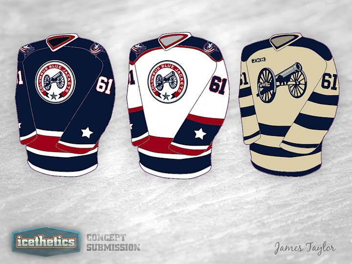
If there's one thing the Columbus Blue Jackets need more of, it's cannon. There are three cannon in this one concept alone by James Tyalor. What do you think? Should the third jersey logo become the primary mark some day?
Designed by  James Taylor
 James Taylor


Reader Comments (15)
If this franchise still exists in a few years after Nash is gone....these would be great. I really enjoy the cannon, notwithstanding the "trendy" circle logos these days. I'm not convinced of the prerequisite of existence though.
Actually pretty sharp looking set.... though just about anything would be an improvement over their current home and away mehs.
Really like that third for some reason, though I can't put my finger specifically on why.
I really like these. I would consider buying any one of those.
That cannon logo is a great identity for the franchise; it definitely needs to become the primary.
I really like how the home and away draw from the original 2000-2007 design with waist stripes and red cuffs. The alternate is a little plain but it would look great if they ever decided to put CBJ in a Winter Classic (lol). I'm not usually a fan of shoulder yokes so I could do without the ones on the away, but otherwise it's a great concept.
I'm probably in the minority here, but I'd really like to see a return of Stinger the Lime-Green Hornet. No joke.
As a CBJ fan, I like the primary mark. But the 3rd logo with the primary coloring looks really sweet. And if (pipe dream) there's ever a Winter Classic at the Horseshoe, that 3rd jersey would be perfect.
Love these jerseys, maybe lose the red but still awesome! I don't really care for Columbus" current logo.
Great concept. Clean, simple, and the cannon looks terrific, especially on its own.
Always been a fan of the old school. Horizontal stripes, shoulder yokes - toss some laces on there and I'll buy one today.
Awesome jerseys for the lamest hockey team in the NHL. They don't deserve to have such a great concept. I would love to see those on the ice.
For those about to rock...FIRE...we salute you! I like them!
Columbus Monopoly Pieces
I think these jerseys deserve to be presented to someone in Columbus, can't see how they'd turn these down. Great concept
Absolutely beautiful. I agree with Steve. These need to be shown to someone in Columbus.
Especially the third jersey. Simple but powerful.
The AC/DC is strong with these ones. Absolutely gorgeous, I would buy one of these in an instant. As what Sloth said, this would be a great identity with the Jackets. Their current logo is bland, this one screams old school badass all over it. Also agree that the shoulder patches are not needed, the jersey is great as it is. Maybe the return of the lime green hornet on the shoulder? Make it even more amazing.
Full on 5 out of 5 for this one.
These look pretty badass....certainly an upgrade from what they currently wear. The cannon is a good identity for a team that doesnt really have one at the time. However, IMO, cream white is a color that should NEVER be worn....I understand the "vintage" look, but plain white just looks better every time.