Wednesday
Jul182012
0151: That's Wild!
 Wednesday · Jul 18 · 2012 | 9:00 AM PDT
  28 Comments

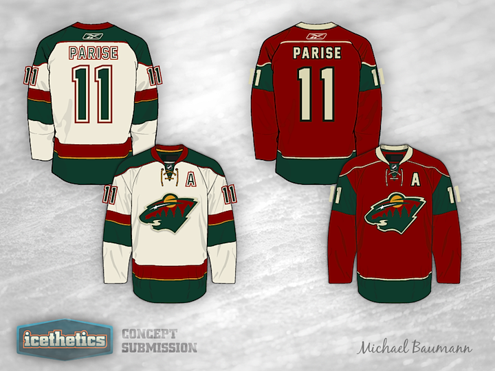
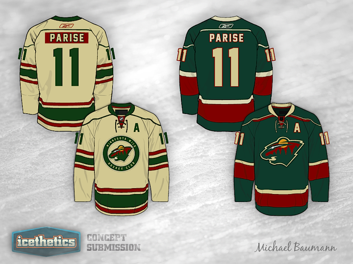
The recent addition of Zach Parise to the Minnesota Wild's roster got Michael Baumann thinking about new jersey design ideas. And it's just in time too. This is the first time we've seen the Wild since the Concepts page got a reboot. He's got a set of four sweaters here. Which one is your favorite?

Designed by  Michael Baumann
 Michael Baumann


Reader Comments (28)
The Wild definitely belong in green. I'd have the current third promoted to primary and a vintage-white based on it as an away jersey.
These are spectacular! They're all great but the first and fourth jersey would make a great home/away set in my opinion!
These are not badly done by any means, but with this color scheme I just can't help but see ''Christmas''.
Dude you did an incredible job. That's better than their regular set. I especially like the green and the regular white.
Out of the four, #4 (all green) is the clear winner for me. Clean design, simple but yet unique.
love the first white one. the second home one could work. I'm not sure about the sizing of the logos, though.
They're all good, but I would like to see the second set because vintage white just works with the Wild, as does the forest green.
These are awesome! I especially like the small use of yellow (gold?) in the very first jersey (upper-left). This is the first time it ever hit me that the Wild use the color in their logo but not the jersey. Excellent job over all. You should be proud.
These are phenomenal - #4 as the Home, #1 as the road and use #2 as the 3rd. I like #3 as perhaps an "outdoor classic" jersey, but it feels just a bit dated for normal use.
Exceptionally Well Done!!!
This is an astonishingly massive improvement over what they already have. Keeps their awesome logo front and center and keeps all the colors, but doesn't look at all Xmas-y.
On the off-chance that any Wild execs visit this site, please contact Mr. Baumann!
Still not a fan of the red jersey, maybe as an alternate though. Even then Green is the way to go. Like many people have said, make the green primary and a vintage white version for the away jersey, and the Wild will easily have the best (in my opinion) jerseys in the entire league.
Awesome job I would go with the second set!
I flat out would be all of these. Both white are unreal and I agree, the green should be the home. Somebody get these concepts in front of management!
These are great. Combine the white one with the green one and you have a fantastic set.
I have never been a fan of the Wild jerseys, but these would change my mind.
I love the white jersey. I always have. That version looks way better though! I would also love to see the green one come back and get rid of the 'Pizza Pop Red' jersey. I can't stand it. I also don't like how they put one of the best logos of all time into a circle and made it small. Great work Michael. Great friggin work.
Well done! Like so many has mentioned before, I'd go with with Green as home, White as away and Red as third. I can't bring myself to like the vintage white though, but I just don't like that colour to begin with. The vintage stuff the Wild are doing makes no sense to me to begin with.
I'd prefer more of a green and yellow scheme (like the North Stars). The green jersey gives me too much of an Islanders vibe.
So its decided. Mr Baumann knocked this out of the park (can you use baseball references in hockey talk?)
and just like everyone else it seems, I would have to pick #1 and#4 for the home/away tandem
Each is great on its own, but for the sake of uniformity would you make the sleeve and waist striping the same on each jersey (not in size or thickness, but make one jersey match the other)
The first jearsy to me screams retro/heritage with out using that semi-awful off white colour that eveyone seems it think is the epitome of age.
I dont get that same feeling from the forth one, but that doesnt mean its any less good.
And the 3rd one seems like it would be great for a winter classic or any other one time use special jearsy.. its good but i wouldnt want to see it too often. And this is the only one that I get any kinda of christmas effect from.. maybe its the candy-cane-esque striping
Hands down, one of the best set of concepts ive seen... and im not even a Minni fan
Can't decide which road uni I like more. Very good concepts! When I think Minnesota I always think old-time hockey... I have no idea why, but I do. I think the Wild could get away with a vintage white or cream road jersey. I think the league needs at least one.
Honestly wouldn't change a thing, and I completely understand the reasons for choosing the home and away as the white and red jerseys. Absolutely perfect for this team!
That vintage white jersey with the circle logo (things most of you guys hate), is definitely one of the single best concepts posted since this website began with the daily posts. Awesome.
If the sleeve and waist striping on #4 was tinkered with to match #1, that'd make for an awesome home/away set. Could keep the current script third.
As a lot of others said, the white and the green are both spectacular. The red could be a fine alternate, but I don't much care for it. Just red Wild jerseys in general. The logo on the vintage white one is good and it'd make a great alternate, but for the fact that that would mean the visiting team would have to bring their home and away sets on the road trip.
I would say the white one and green one with the red as an alternate and they they could use the vintage white one for a potential Winter Classic or something in the future. One of the best sets I have ever seen on this site.
best concepts I've seen on this site in a long time. The wild should take note. I think they should have green as a primary like most folks, but I find their current word mark green jersey incredibly boring due to the lack of a logo.