Thursday
Jul192012
0152: Ahoy, Penguins! Arrrgh!
 Thursday · Jul 19 · 2012 | 9:01 AM PDT
  8 Comments

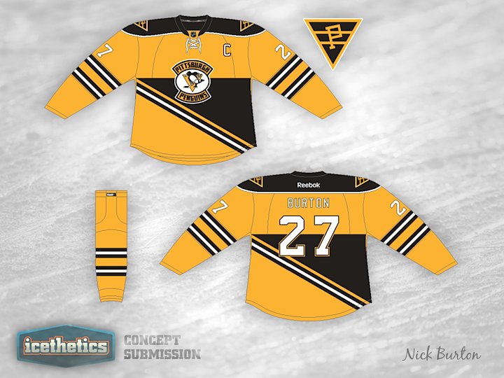
Maybe I should've saved this concept for Talk Like a Pirate Day, but that's still a couple of months down the road. Nick Burton has an interesting jersey offering for the Pittsburgh Penguins based on their Steel City NHL predecessor, the Pirates. This isn't the first concept we've seen from that era of the NHL in Pennsylvania...

You may recall a number of Quakers-inspired Flyers jerseys that started appearing when it was announced Philadelphia would host its first Winter Classic last year. This one by Jack Gambro was one of them. I'm reposting it here because I think it makes a good companion for the Penguins/Pirates look above. What do you guys think? Would these make for a great-looking game or what?
Designed by  Jack Gambro&
  Nick Burton
 Jack Gambro&
  Nick Burton


Reader Comments (8)
All I can say is a huge "YIKES"
The black triangle on the Penguins jersey is kinda distracting. Not sure if would it look better to continue the black up the jersey to the shoulders, while leaving the sleeves as is or switch the black to the bottom part of the jersey. Personal I'd just bring it up to the shoulders.
That would make for a really awesome, albeit extremely violent/hate-filled Winter Classic.
I like the logo, not the large black triangle.
not a big fan of either. If you look at the Penguins jersey, the black body triangles dont actually connect on the side, which is what I would prefer just for color continuation. Just a personal opinion though. While throwbacks are great, there have been others better for both teams.
LOVE IT!!!!!!!!!!!!! Pens should have worn this and made it their third instead of that 2011 winter classic abomination jersey.
Cool Rock'n'Roll
One of these jerseys would have to be primarily white for a game. I would keep the pens jersey yellow and make the Flyers one white. If it was white with orange stripes, shoulders, and cuffs, but keeping the logo and numbers black with black gloves and pants, i think it would work.