


Saturday
Jul282012
0161: Blue Jackets Re-Bourne
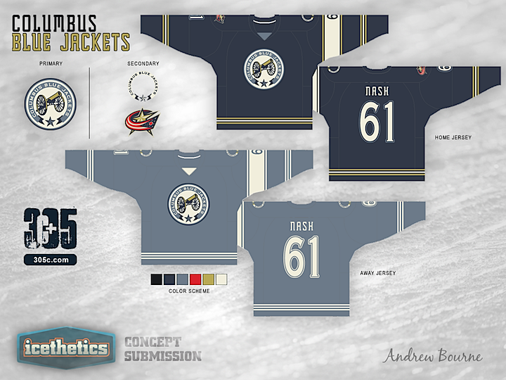
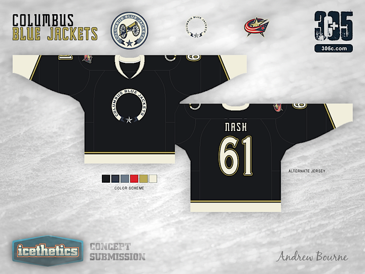
The Re-Bourne series took a brief break during Minor League Week, but Andrew Bourne is back with his take on the Columbus Blue Jackets. He didn't send me a description on this one so you'll have to fill in the blanks on your own.
Designed by  Andrew Bourne
Andrew Bourne 

Reader Comments (15)
This is by far the best Re-Bourne so far. It's something different. I can see many people disliking this, but I really like this direction. Also, the simple logo on the alternate jersey is a very original idea. Kudos.
The circle logo with nothing in it is really wierd IMO
What's with the away skins? Is it some sort of faded relic?
Unfortunately, I don't quite understand any of these jerseys. Very bland.
Wrong name and number!
I usaully like Andrew's concepts , not this one. Why would a team called BlueJackets has a black 3rd? The away looks like it something tha can't be clicked on . I think the lone white stripe on the left arm looks out of place.
What am I looking at?
Too soon bro.
With the home, I was thinking that it may be an interesting take. The road completely lost me (maybe it's the loss of the lines in the jersey, but the faded look is strange). The alternate is a bold take, but I'm not a fan.
Quick note: the uniforms were based almost solely on civil war uniforms. I used many images to design these uniforms, one being this: http://learnoutlive.com/wp-content/uploads/2010/11/civil-war-uniform-north.gif
Thanks for the feedback. Sorry for the lack of description!
The lower one needs to have the modern logo in the circle, and the cannon for the shoulders
Hmmm....no thanks.
There needs to be more going on in the bottom, but I love asymmetric hockey jerseys! This one could use work but the basic premise is solid.
However, I agree that the circle with nothing in it looks weird, but it's better than their current logo that's for sure.
I dig the empty circle. I'm not sure why, but I just can't look away...
I think the Ohio flag logo's red looks out of place. You wouldn't be able to recolor it, but I'm not sure if the empty circle should be on both shoulders... hmm.
The biggest complaint I have is there is no white jersey. I think the NHL would have a problem with that...
Anyways, while not the best concept I've ever seen, it's at least original.
do not like the washed out colours. don't understand the red in the logos, especially with the step towards a blue and gold colour scheme... IMO should have left the red, and the C-star logo behind. pretty bland overall, but I appreciate the civil war theme that was attempted.