


Sunday
Jul292012
0162: Revisiting the Winter Classic
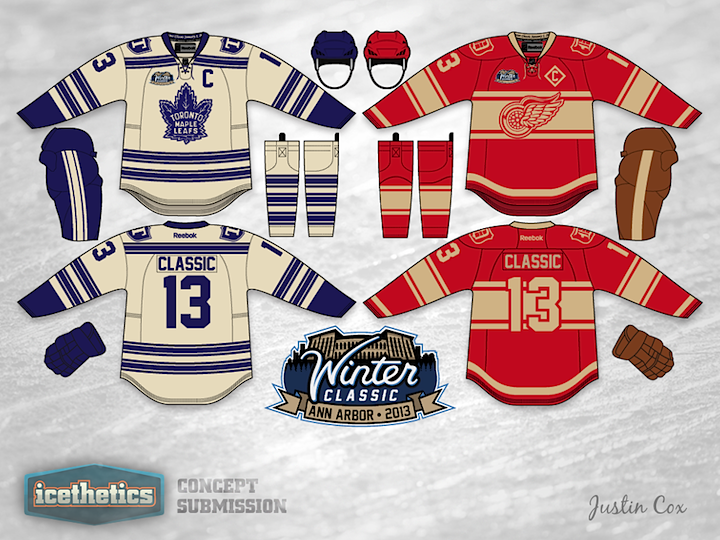
It occurs to me we haven't had a Winter Classic Weekend in quite a while. I'm bringing that back today. It also occurs to me that we still haven't seen an actual 2013 Winter Classic logo yet! Justin Cox is happy to provide both for us today. He's created a beautiful set of uniforms along with an impressive logo. Overall, one of the better concepts I've seen in quite some time!
Designed by  Justin Cox
Justin Cox 
Reader Comments (10)
Amazing. Would love to see these in the Big House next year.
Wow now that's a Classic Design
I get the whole "classic" thing, but does every jersey have to be that ugly off-white color? The jerseys of yore were probably white when they were first made, and this pseudo-vintage look just looks cheesy, especially on the high-tech RBK edge jersey.
i hate the antique white usually...but these actually look good with it
Very well done! The vintage white numbers on the Red Wings jersey might be difficult to see, especially in a stadium as big as Michigan Stadium, so I think a shade like that used on the Maple Leafs set might be better. Other than that, I would love to see something similar to this being worn for the Winter Classic!
So it's decided then... Those are going to be the winter classic unis.. No excuses.
There are some very Habs-esque lines to that Red Wings jersey.
I like it though, and as someone who might be going to the WC it may just sway me to the Wings side. Halte là, halte là, halte là, Les Ailes Rouges, Les Ailes Rouges...
Those are gorgeous, i agree that the off white/vintage white is sometimes done to death, but these look amazing!
I agree that these should be used and no excuses! If no then they better come up with something better, or it will be a major disappointment after this idea!
It'd be better if the back numbers on the Wings jersey were red with a white outline. They'd be more visible in that white stripe.
all sorts of amazing going on right here.