Wednesday
Aug012012
0165: Real Hurricane Flags
 Wednesday · Aug 1 · 2012 | 9:00 AM PDT
  6 Comments

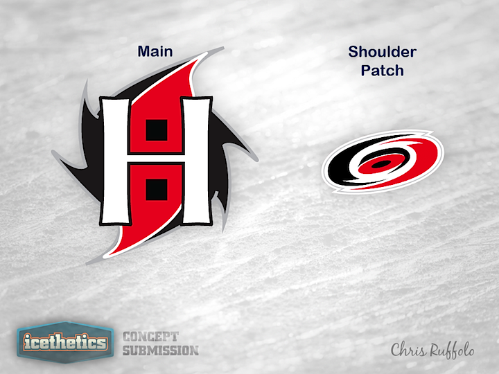
Occasionally on this site, the Carolina Hurricanes' secondary logo will be criticized for not being true to its namesake. As any Gulf or Atlantic coast resident can tell you, the red flag with the black square in the middle pops up on beaches when a tropical storm threatens. However, when a hurricane is on the move, a second flag is added beneath the first one. In other words, technically, the secondary logo is representing a tropical storm rather than a hurricane. Chris Ruffolo's concept logo may be among the best I've seen at incorporating both flags. It could use a little more polish (and perhaps a rightward lean) but I really love the idea of making the two flags form an H. Very well done!
Designed by  Chris Ruffolo
 Chris Ruffolo


Reader Comments (6)
I think it looks like Shadow the Hedgehog
What I like the most about the "H" is that it almost grabs a little heritage and utilizes the Whalers logo which also formed an "H" for Hartford
tbh, i don't really think it matters if 1 flag is only a tropical storm. The one looks 10x better than that weird *** thing.
how do the flags form an "H" i like the idea of incorporating an "H" and how it can relate to the whalers days. But the flags dont form an "H", there is just an "H" stuck on top of the logo. They couldve dont better with that. That said i like the idea a lot
i like it, wonder if it could be better if the "H" had a little more movement and its lines were designed to recplicate the flow of the circulating logo. Like how the Reg shapes have a white outline, have that stroke run into the "H", make it a little more fluid.
Everyone always says that Carolina only has one flag on their jerseys and therefor is not an actual hurricane, only a tropical storm. Well, there is one on each shoulder, which makes two, which is a hurricane. That's how I see it.