Monday
Jan062014
0689: Carolina Alternate
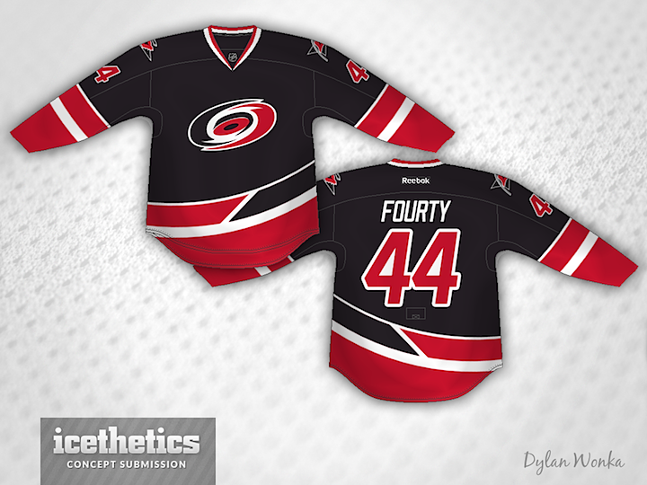
Sometimes you see a concept an have an instant reaction, good or bad. Normally I have to look at something a while before I can form an opinion. But this one from Dylan Wonka hit me immediately. I love this as a third jersey for the Hurricanes. It's one of the most unique striping patterns I've ever posted on these pages. What's your take?
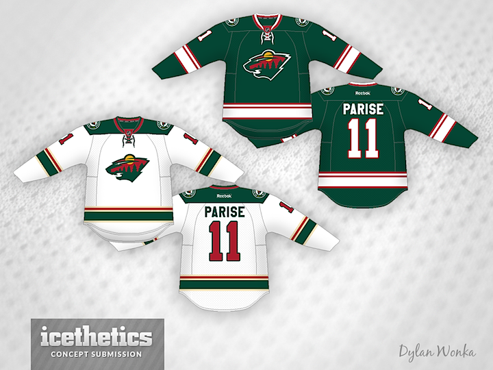
Designed by  Dylan Wonka
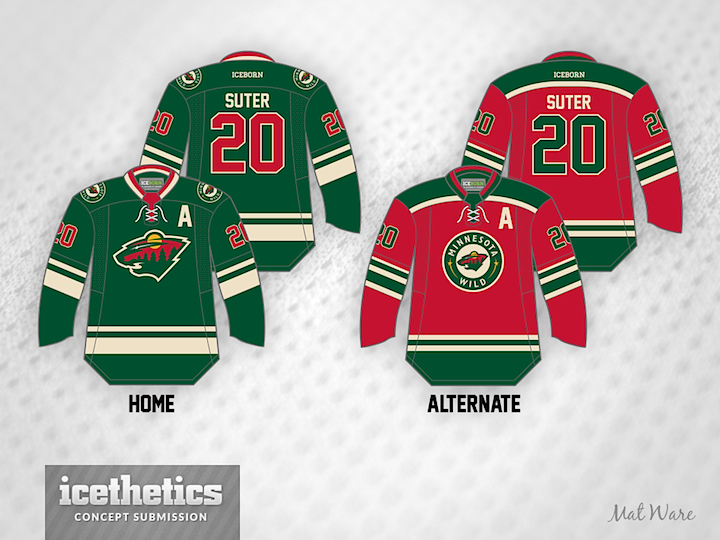
Dylan Wonka