


Friday
Sep212012
0216: The Hartford Nordiques
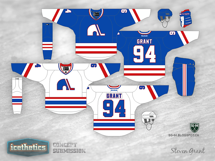
Today brings the other half of our Freak Out Friday two-parter. Last week, you saw Steven Grant's take on what a Nordiques-inspired Whalers jersey might look like. So how about the other way around?
Designed by  Steven Grant
Steven Grant 

Reader Comments (6)
It looks weird without the puck.
Looks sharp but I don't see much resemblance to anything Hartford :/ Although the stripes are from the Whalers jersey I wouldn't have guessed that unless you told me.
Actually, if the Nordique logo is replaced with the Montreal Canadiens logo, either jersey would make an excellent third/Winter Classic Hab jersey as the bleu, blanc, rouge are more Montreal colours compared to Nordique blue and white.
I like how the white jersey has the blue igloo with the red stick. that looks sharp.
it gives the classic Nords jersey some much need colour... I agree that it is not obvious that is a Whaler design
The blue one look too much like the Rangers.