


Thursday
Sep272012
0222: Blue Jackets and Gold
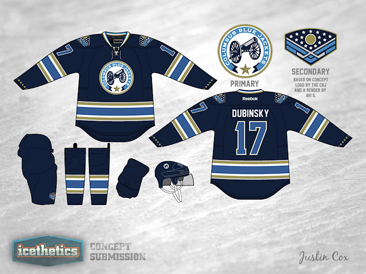
This week seems to be all about changing the color palettes of existing teams. So why not give it a shot in Columbus? If the Stars were to switch to red, white and blue, maybe the Blue Jackets could switch away from it. Justin Cox infuses some gold into a design inspired by the club's alternate jersey. It's a pretty sharp look and would certainly be unique in the NHL.
Designed by  Justin Cox
Justin Cox 

Reader Comments (12)
This is awesome. It perfectly reflects the team's name and Civil War heritage. I'd buy this
I would L-O-V-E LOVE to see an away of this.
As a CBJ fan, this is really nice. I would have liked to see a little red infused in this jersey when it first came out, so adding the gold was a nice touch, as was the stars at the sleeve base.
Wow this is a great jersey...clean design and GREAT color choices. This is ready for the NHL.
Make this their new 3rd jersey, please!
Excellent!! Produce it!
Very sharp.
I think this is absolutely amazing...someone forward this to their front office
This is an awesome concept, would be great to get the Blue Jackets front office to seriously consider this for wear in the near future.
The more I see this, the more I like it. I'm, personally, a big fan of their current primary logo and do not like the current alternate. But this version is spectacular.
this is a beautiful jersey! if the jackets were smart, they'd make this their permanent look and create a coordinated white to go along with it.
these would probably be one of my favorite jerseys in the league.
This design has been up for a few months, but I just found it...What a phenomenal jersey! I love the cannon logo, and adding gold makes it even more appealing. Eliminating red from CBJ unis will help diferentiate the team from the sea of red in our new division, as well.
If Justin might be willing to try another version with a slightly different twist, I would be curious to see what it looks like with the current CBJ secondary shoulder patch (gold instead of red around the cap) rather than the chevron concept for a secondary logo.
Way to go! I hope John Davidson sees this design.