


Wednesday
Sep262012
0221: Stars of Texas
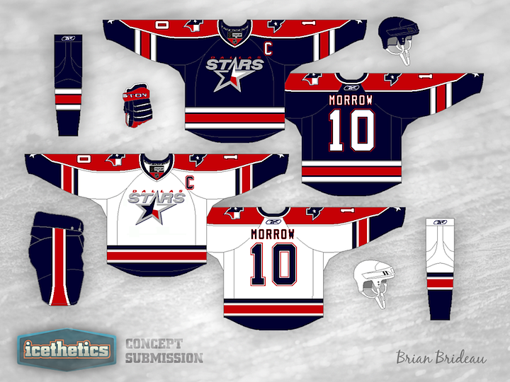
Don't expect the Dallas Stars concepts to slow down anytime soon. It's almost all I'm seeing. With a rebrand in the works for 2013, everyone's throwing their hat in the ring. Here, Brian Brideau suggests a color palette more in line with that of the team's home state of Texas. Is red, white and blue the way to go? Or do we already have too much of it in the NHL?
Designed by  Brian Brideau
Brian Brideau 
Reader Comments (16)
These are a good start. What I'd change would be to eliminate the red shoulder stuff and just do horizontal arm stripes on the home and away. I'd also change the color of the Word Stars and the star to add some blue in to it to make it stand out more on the jerseys. Maybe leave it silver on the home blues though.
I like how the colors incorporate the colors of the Texas flag into the mix.
However - not sure that is a true representation the identity of the city of Dallas vs. the entire state of Texas.
One way or another the Stars are certainly overdue for a new look/identity to that franchise.
this isnt bad at all. yeah there are already teams in the NHL with this color pallet, but i really like the logo design. it breaks away from any notions to the original North Stars franchise and establishes itself as a Dallas franchise. i like the stars are the sleeves but the overall uniform itself looks a bit like Columbus. but it's still a great concept for a hockey uniform, great job Brian!
Great, they would look exactly like 80% of the league
Pretty cool but I think the Stars must be green and gold (and perhaps black)
I don't mind this concept, especially the modification of the logo to incorporate the state flag. However, the colors, even though they look fine in this concept, would never go down in Dallas. After all, how could the team even consider selling paraphenalia with the same color pallette scheme as the Houston Texans?
Good attempt, though (even if any concept would be better than what the Stars are currently saddled with).
I really love the design. Incorporating the state flag into the main logo seems like a no brainer... Looks great.
I just dont think we need another team in red white and blue, a shame because it would make sense for Dallas..
not much wrong with those, maybe i'd make a change to the arms / shoulders and add some more silver, apart from that, that looks pretty good for a re-brand idea......
Use the exact same design, swap the Blue for a darkish green, the red for silver and the silver for Gold and I thnk you would have an absolute winner!
Keep the green and gold, it's a unique identity these days. This set screams Florida Panthers with a Texas star to me.
A good design, however i personally hate navy blue, red and white jerseys.
Excellent logo for sure. but i believe with dallas being one of the only green teams in the league they should keep it that way. they could really run with the kelly green and gold they wore from time to time as a third jersey. but definitely a creative logo.
I love the logo touch-up, not 100% sure about the jersey designs, though. Still a very solid concept. Oh, and @Rob Huck, the Texas Rangers (Arlington, TX) use red, white and blue and no one there (less than a mile from Cowboys Stadium) confuses it for the Houston Texans.
No! No No No No!
The template, great (would love to see it in the original '93 style), the colours are awful. The Dallas Stars are Black, Green and Gold. That's it. Red, White and Blue is the farthest thing from what the Stars should become, and such a radical departure from Stars' history won't go down well. The Stars' colours are fine, the last time any new colours were introduced we got the Mooterus. Please leave them alone!
I like the logo, but not the equal parts of red and blue on the jersey.
Choose one color for the base and one for the trim. BLUE with a little silver and red or RED with a little silver and blue.
Uniforms look great with the state of Texas flag in the star...... "the new Americas team" The heck with the cowboys
I really enjoy the jersey, however as other people said, keep the gold n' green(or green n' silver in today's case). It might be a good jersey for the Texas Stars, so they don't look like a Dallas Stars copycat.