Monday
Sep032012
0198: Calgary's Black Flashback
 Monday · Sep 3 · 2012 | 10:49 PM PDT
  6 Comments

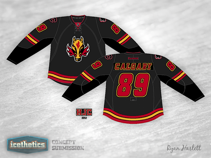
Remember when the Flames used to wear a black jersey with a fire-breathing horse on the front? Ryan Haslett does and he's based today's concept around it.
Designed by  Ryan Haslett
 Ryan Haslett


Reader Comments (6)
lose the yellow and exchange it for a dark grey. the red's from the collar should match the red from the stripes as well.
If the Flames take their current alternate (the throwback uniform) and make it the home with a white version to match as the road, I'd be more than fine with this as the alternate. I like the near-black main color and using the actual black to make the sleeves pop. Very cool.
The only thing I notice - and this may be my monitor - is that the color and flaming C outline appear to be a different shade of red (more of a magenta) than the striping/name/number/crest.
i thought that horse had been shot and turned into dog food or glue!!
as you might guess, i was never a fan of the weird looking horse logo, the jersey design itself is ok, perhaps a red flaming Calgary word mark could work (and have the horse head as shoulder patches instead)??
i think it would look better with the rest of the stripes
That flaming horse-nostrils logo should be taken out and given a fast but painful death.
Otherwise, not a bad concept. I like the black flaming C on black, and the numbers and lettering are solid.
@Drew, I also noticed that magenta vibe on the shoulder "C" and also thought it was my monitor....Whenever there's a rare Flames concept I always get mixed emotions. Really enjoy the varying black idea, making the true black pop. Really enjoy the yellow-bordered numbers and letters. Really don't enjoy the fire breathing horsedragon or the curved stripes on the bottom. I always thought that that logo was a poorly executed great idea. If you straighten the bottom stripes, complete the arm stripes all the way around, and find a way to update Steamy-Breath, you've got yourself a winner.