


Monday
Jan282013
0345: Missing the NHL All-Star Game
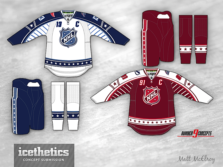
If we hadn't lost the 2013 NHL All-Star Game to the dumbest lockout ever, it would've taken place in Columbus yesterday. In that spirit, we've got a sharp All-Star concept from Matt McElroy today. It's a neat evolution of the previous NHL All-Star uniforms — a set I wouldn't mind seeing on the ice someday.
Update on Wednesday · Jan 30 · 2013 | 12:26 AM PST by
 Chris
Chris
Chris
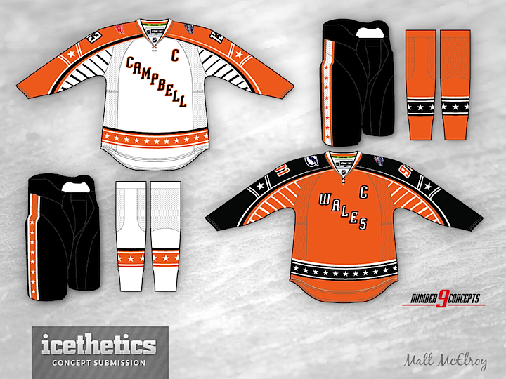
By popular request, Matt has created Campbell vs. Wales versions of the above jerseys.
Designed by Matt McElroy
Matt McElroy 
Reader Comments (9)
I've been getting tired of the Red, White, and Blue All-Star Game jerseys as of late but these are fantastic.
These are fantastic!!! Someone send this to the NHL/Reebok.
Part of me wishes that they would do Black versus Orange again. Wales versus Campbell.
I'm so glad to not be alone! I'm also a big fan of these designs, but wish NHL would get this color scheme out of their system and BRING BACK THE BLACK AND ORANGE!! I miss the old conference and division names too....
Does the NHL have "Official Colours" anymore or did that go away with the NHL Logo change? I like the old Black/Orange combos... that said, theses are really nice designs and would enjoy seeing them in next season's All-Star game.
The only thing I would change on this design is to take the numbers off the front. I find this trend really annoying.
I would add a thin blue/red stripe to the bottom part of the hem stripes, because it looks like it's missing. I would also change the color of the squares in the arm parts respectively to steel blue/lighter red.
Otherwise, this is a really good, near perfect design! One of the best looking All-Star concepts on this blog!
THAT UPDATE IS AWESOME!!!
I'm really not a fan. They're just--boring. It's not a knock on the artist, as I know he is working with what the NHL is already using. They're just too busy for me, and the weird stripes and front numbers bug me for some reason.
I would love to see the NHL use black/orange again. If they wanted to "modernize" the jerseys with the official NHL colors, I guess they could try silver vs. black, but I feel like that would take a really good concept to work with those colors. To me, it's not just that retro is a cool fad--it's that the retro stuff is flat-out better than the stuff they put out now.
Update Seeing Matt's updated concept, I really like the simple changes that were made. The modernized striping and curves don't seem as out of place. I don't know what it is, because the changes are really quite minor, but this new concept just plain works.