Monday
Oct142013
0605: Desert Do Over
 Monday · Oct 14 · 2013 | 8:00 AM PDT
  8 Comments

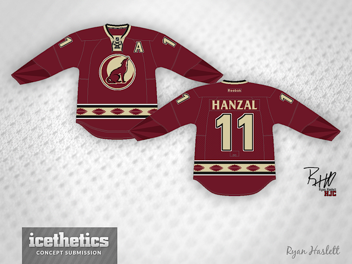
The Phoenix Coyotes become the Arizona Coyotes next year and with that brings an opportunity for an identity refresh. At the very least they could adopt a new third jersey. This one from Ryan Haslett borrows an unused logo from the club's 2008 third jersey prototype process.
Designed by  Ryan Haslett
 Ryan Haslett


Reader Comments (8)
except for that, whatever it is, on the sleeves, i like it! got a good, non-generic look without being too gaudy.
Everything a modern jersey needs to be. Innovative, but not gaudy. The only thing I'd do (which is not even saying "no" to your ideas, more expanding on them) is to work some off-white hairline cross-hatches into the waist stripe to make it look woaven, like a quilt or poncho. Just on the stripe though.
looks good man, love the sun rays on the arms.
Love the idea of a print for striping, but this one looks a bit like footballs. It would be nice to see some green/purple from the old jerseys come back into the Yotes' look
The crest looks like it belongs on the shoulders rather than being the main. A hockey logo needs a more aggressive or iconic look. This one looks peaceful.
I do love the indian-design stripe around the waist though. Would like to have seen that incorporated on the arms as well. Three stars.
i LOVE that sublimated sleeve detail reflective of the arizona state flag. great concept...aside from the "mom's livingroom rug" pattern on the waist stripe...
I've been thinking of how a Coyotes could make their jersey's better and this is just it. Add an arm band similar to that waist band and I think it could be perfect.
This is a pretty sharp design! I really like the colours the Coyotes use, very simple, but not looking too much like DET.
The rays on the sleeves are a nice touch, and I like the direction of the artistic tail striping... kinda like how the Hurricanes used a non-stripe icon to create a tail stripe (still a big mistake dropping the flag, CAR).
I think the Coyotes have one of the best animal-themed logos in all of sports. It's not anthropomorphic like the Penguins, it's not overly aggressive like the Sharks... it's simple and clean.