Wednesday
Oct022013
0593: That's Mighty Retro!
 Wednesday · Oct 2 · 2013 | 8:00 AM PDT
  9 Comments

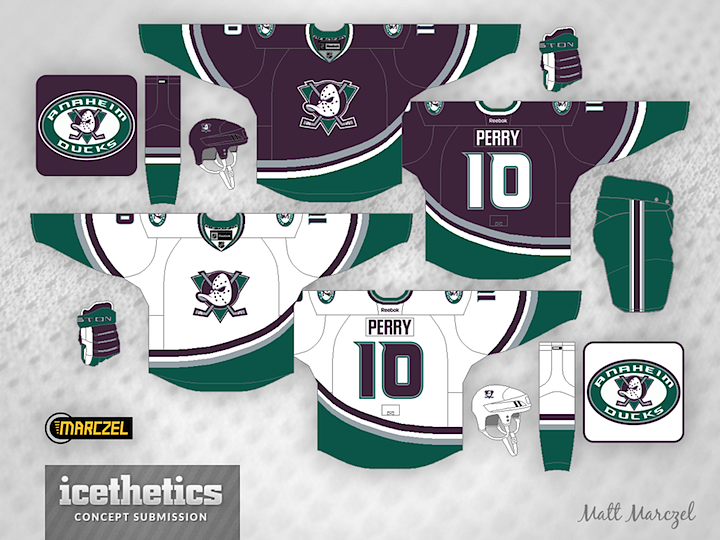
In less than two weeks, the Ducks bring back what once made the "Mighty." In the meantime, we have Matt Marczel's modernized take on an Anaheim classic.
Designed by  Matt Marczel
 Matt Marczel


Reader Comments (9)
I love it! I wish they used these full time.
This should be their third...make it happen. They could swap the shoulders for the current D logo to keep the branding current. Great job.
Wow that's a perfect mix of old and new! I love the teal pants with the silver/white/purple stripes and the new font and stripe style. Well done, I'd buy that in a heartbeat. Can't wait to see the retros on the 13th!
I would change the pants to purple, flip the home socks so the green is on the top like the old socks and make the logo sticks yellow again because the grey sticks make the logo look kind of dull.
Other than that I really like this.
I love this concept! The only thing I would change is the pant color. In my opinion it should be purple, but maybe teal would look cool on the ice. Great look for the ducks though!
Make the pants eggplant rather than jade, then it's perfect.
eggpant pants and these would be close to my favorite jerseys in hockey again
TAKE MY MONEY NOW!!!
I really don't get the fascination with these colors. I know there's the whole nostalgia thing, but the colors are just so drab and dull and dreary.