Thursday
Oct032013
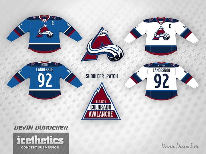
0594: Dual Blue Avs
 Thursday · Oct 3 · 2013 | 8:00 AM PDT
  10 Comments

Devin Durocher made a handful of tweaks to the Avalanche's uniforms — and even the logo. But while I like the two-tone blue color scheme to an extent, the logo without the oval leaves it looking a little off-balanced. What do you think? Good idea for the Avs?
Designed by  Devin Durocher
 Devin Durocher


Reader Comments (10)
The logo works on white but there isn't enough contrast on the blue jersey. Definitely a good start but this needs some fine-tuning.
Est. 1972 ? ....The Rockies franchise is another franchise so that needs to go.
They were established in 1995. I know the Nordiques came to be on that year, but the Avalanche weren't around until '95
The numbering needs an outline.
It looks alright. The logo looks empty without the oval behind it, but it's a nice experiment. In the end, I hope that always stays their logo, it's among the existing 90's logos, including the Panthers and Hurricanes (the Flames too technically, but it's just a tweak).
I'm indifferent about light blue being added to their color palette, but I'm against it being anything but a highlight color. The blue jersey is fine, but I don't think I'd like any colored Avs jersey that isn't primarily maroon. The shoulder patch is clever, but it should say 1995. When it comes to striping, I'll usually only take an Avs jersey with the 1995-2007 mountain striping pattern, but the traditional pattern looks fine here.
Unlike the Wild, I'm glad the Avs have kept their unique number font over the years, and I'm glad you used it here. They just need an outline and they'll be perfect.
Colorado fans do realize that the Rockies have nothing to do what so ever with the Avalanche right?
I like it, but I wish there was more maroon in it. Otherwise, great ideas!
The logo is lost in that shade of blue, but I think the removal of the oval is a much cleaner look. Jarring at first, but an improvement IMO.
What I'm not liking about the jersey is the removal of purple. I like the dual blue, but the blue/purple combo they rock now is fantastic. The jersey they wear now needs updating, but the colours are fantastic.
This looks great, I really don't get the negative comments. I think with a bit of adjusting it could be fantastic. Striping is unique and cool. The baby blue is great it hearkens back to the nordique days.
Love how crisp the white jersey looks. That is a get up that should be worn at home.
I agree that there could be a bit of tinkering for the logo on the dark jersey. I almost wonder about a canucks dark jersey white logo idea. I think it could work.
I also look at this expecting the "red" to be the maroon they currently wear.
I really like the striping, but am not crazy about the two shades of blue. Between the Jets, Blues, the various Penguins 3rds, and the old Panthers 3rds, I think it has been done enough. Maybe switch the dark blue for the burgundy on the dark set, and use that nice lighter blue instead of the dark blue on the home jerseys.