


Friday
Oct042013
0595: Colorful Freak Out
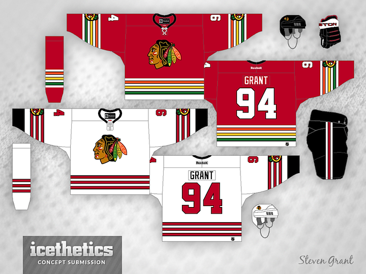
Steven Grant has been working on a series to "de-Edge" the NHL — returning the jerseys to the days before 2007 when Reebok changed some things. But I can't say I'm a huge fan.
Steven wrote, "I haven't seen many concepts for the Blackhawks that use the colours from the logo in the striping, so that's what I tried here."
Designed by  Steven Grant
Steven Grant 
Reader Comments (12)
I like both of these jerseys. However, I can only really see the white one in today's NHL. The red jersey just seems to be made for a different era, early- to mid-70s, perhaps. Good work, there's definitely some interesting potential here.
Big fan of this actually! Really like the red one, the more color the better
This is quite an interesting idea. I'm talking about the crest colors on the sweater thing. As for "de-Edge"ing, I'm all for that, I will always prefer the pre-Edge days, primarily the early 2000's.
This isn't a bad idea, I'd like to see it stick for a while; but I don't think the Hawks should change their primary jerseys, ever.
NO.
as someone that is colorblind, it took me two or three looks to figure out that the stripes were different colors. (ok, i could tell the yellow was different.)
The white set is fine, but the orange, yellow and green striping on the dark set just doesn't work for me.
White jersey isn't bad at all. I'd rather see the "C" logo stay on the shoulders for both jerseys and not move to the arms. As for the stripes on the red jersey, not a big fan. It just doesn't look right.
Meh. Idk about the white, but I think I actually like the Red one. Looks like one of those random wierd jerseys a team would use for like 2 years an then it develops a cult following decades later.
I like Steven's creativtiy here, I can see the white working, the red's cool but it would only work as a 3rd at best. Now as for de-edging I'm 100% for that, can't they make the jerseys look like sweaters with the breathable material the edge uses?
BRILLIANT! And here's why.
A lot of the ICEHL logos are three, four - even five colors. And the designers go overboard and try to use all of the logo colors on the jersey, when two will work.
I was going to submit Blackhawks jerseys using all the colors (not enough tan skin used here) plus the original Predators (orange, yellow, silver and two blues), the original Coyotes (purple, brick, green, black, tan) and Thrashers (two blues, two golds and a red).
the red one reminds me of fruit stripe gum pack
great for the same reasons the nuggets and astros jerseys were great