Friday
Nov012013
0623: Buffalo Freak Out
 Friday · Nov 1 · 2013 | 8:00 AM PDT
  14 Comments

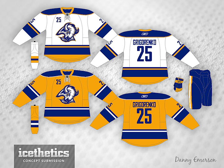
All right, which is a bigger freak out? The Sabres' actual third jersey? Or this white and gold "goathead" concept from Danny Emerson?
Designed by  Danny Emerson
 Danny Emerson


Reader Comments (14)
i think it would be a cool third jersey but not a full time home/away set
Freak out? These are gorgeous! Even with the Canucks' number font and the silly front numbers, I rated these a 5.
This is actually pretty good. I have never had an issue with the chest numbers on the Sabres jerseys, largely because they originated it - it originally made them unique. These are definitely better than those ridiculous 3rds they are actually going to wear.
These are great! MUCH better than the current ridiculous third. I love the white!
I friggin love the white concept. I would love to see that. Not too crazy about the yellow one, that being said, I like seeing it more than another blue jersey!
Freak out? This is way better than their new thirds. The white one is a little better but I could live with the yellow version for 10-12 games a year. This is nicely done, IMO.
Not sure why this is a "Freak Out".
The gold jersey would make a great third.
The actual third jersey is the bigger freak out. Take off the front number, and these are perfect! I hate the Sabres, but these are beautiful. Mix in an 80s Royal Blue home jersey (and make the yellow the alternate), and this would be one of the nicest sets in hockey.
This is what I have been asking for. I would love to see the buffalo head jersey in the current uniform coloring!
Funny thing is that its still better than their current thirds.
Take away the front numbers, add some crossed sabres under a smaller buffalo head, turn the gold jersey blue, and you might really have something.
Get rid of the yellow on the bottom of the white jersey, and these would be better than anything else Buffalo has worn, besides their original look of course.
My jaw dropped as a saw the logo, that's all I need to be happy; with it being my favorite Sabres logo, of course.
Now while it seemes to be more suited for more unique jerseys such as the ones it was used on from 1996-2006, it kinda looks out of place here; not to mention the fact that there's no black/red colors to contemplate it. But in any case, I wouldn't be mad at all if they used these to replace their current ones, though their current ones are there to stay for a good while anyhow.
I like the white one, use that template and replace white with blue/blue with white, and you got a great concept! I would also take all that yellow off the bottom of the hem.