Thursday
Nov142013
0636: Nashville Back in Blue
 Thursday · Nov 14 · 2013 | 8:00 AM PST
  4 Comments

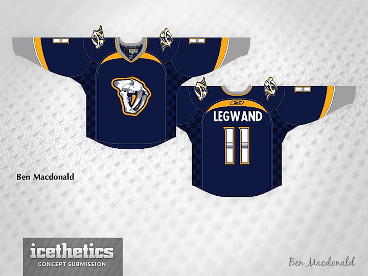
Ben Macdonald has been a regular contributor to our IceHL jersey design contests. Today, he presents a blue third jersey for the Nashville Predators — inspired by the team's previous alternate uniform. I could see this working out very nicely!
Designed by  Ben MacDonald
 Ben MacDonald


Reader Comments (4)
I'm not liking the checkerboard pattern on the sides of the jersey. I know it is to tie it in with the old blue third jersey, but they did move on from that colour scheme. I also don't like the re-introduction of grey. It was taken out, and I don't see why it should be brought back. Though it would be interesting to match this with gold pants and helmets (ie the Jr A Carleton Place Canadians ) to complete the look
ok, not sure about the skull logo (perhaps use it as the shoulder patch?) or the checkerboard, but if you swap the grey for yellow and the small yellow stripe for white and put the normal logo back on, i think that would look better.
I like the color scheme, but the sabertooth skull should be abandoned. Too detailed, too 3-D, too minor-league. It might look better with the guitar pick or NP alternate logo as the centrepiece.
I bet that's the kind of concept that would look much, much better on a, actual player photo. The checkerboard pattern would really pop. I'm not a fan of gray when used on large parts of a logo. Without a lighter color, gray just looks like a duller white (bolding the white stripe a little bit would help a lot). But I feel like that would be a fine 3rd jersey. It's definitively unique when compared to the rest of the league.
I like it. A hemline would help bring the whole thing together as a jersey, IMO. Not something too big; that would clash with the side panels. Maybe something more subtle, like LA's silver stripe on their home jersey, but a tab thicker? Either way, I'd be curious to see the whole thing; helmet, socks, pants, etc.