


Monday
Nov182013
0640: Hello, Colorado!
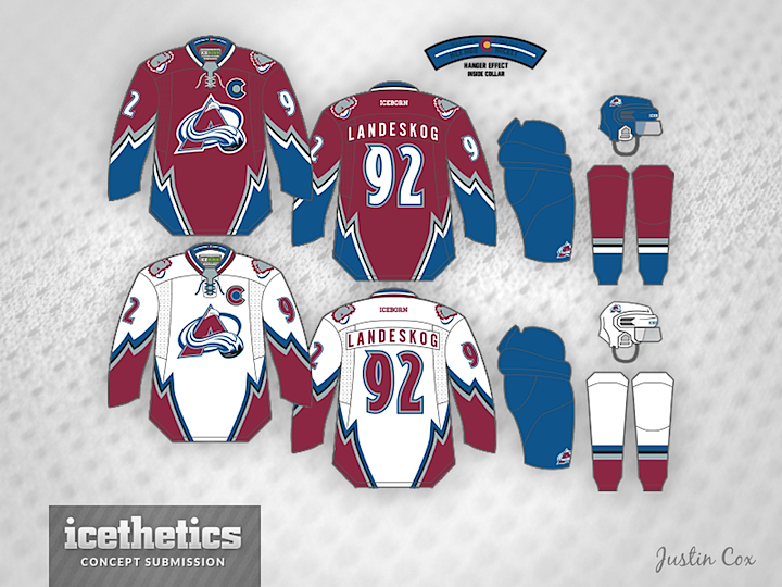
One of my favorite designers, Justin Cox, is back with an awesome new jersey set for the Colorado Avalanche. Note the captain "C" inspired by the state flag!
Designed by  Justin Cox
Justin Cox 
Reader Comments (14)
This is a good set, BUT I am having a hard time imagining what the blue pants would look like. It would be good to see this concept on a player, for some reason, I can only see them wearing black pants.
Also, the C looks like the Chicago Cubs logo.
I love the excitement of the jersey though. It feels fun and totally is the Avs. Not like the abominations they wear now.
I love these, feels so much more like the Avs' identity, which they lost with the switch to Reebok Edge, damn you Reebok!
This design is brilliant. The only thing I would change is maybe put a maroon stripe on the pants just to break up the blue a little.
Excellent concept by Justin. I've been thinking this for a long time, but colour scheme minus black looks so much better.
This is better than the original jersey. That makes it the best Avalanche concept I've ever seen.
Everyone: THIS is what a great concept looks like. It's original and new while drawing enough on the past not to be so radically different that it's unimaginable. Easily the best concept I've seen on here in a long time.
Not bad. I'd like to see blue numbers/text on the white jersey
Man, these are just beautiful, especially the white jersey. I'd buy both of them, and I not even close to an Avalanche fan.
Stunning.
Fantastic look. I wouldn't change a thing. I especially like the move away from black pants, helmet, etc. The primary colour scheme is unique in the league and they should emphasize this by relegating the black to an accent. I also echo the comments above about this design being new and original without being outlandish.
Great job.
Beautiful! I would LOVE to see these on the ice!
Pants don't seem right, otherwise, GREAT. As GRANDY01 said, maybe try blue rather than burgundy for the text/numbers on the white? Also, not a huge fan of the captain letter, I understand the significance, but I don't think it works too well, at least not with the circle on the inside.
well done!
I'm an Avalanche fan and I really enjoy this concept. I'd prefer the pants to be black, but aside from that, I'll take it. The homage to the state flag as the captain's C is a nice touch. Well done.
How do we get the Avalanche into these kits by next season?