


Sunday
Nov172013
0639: Beautiful Brooklyn
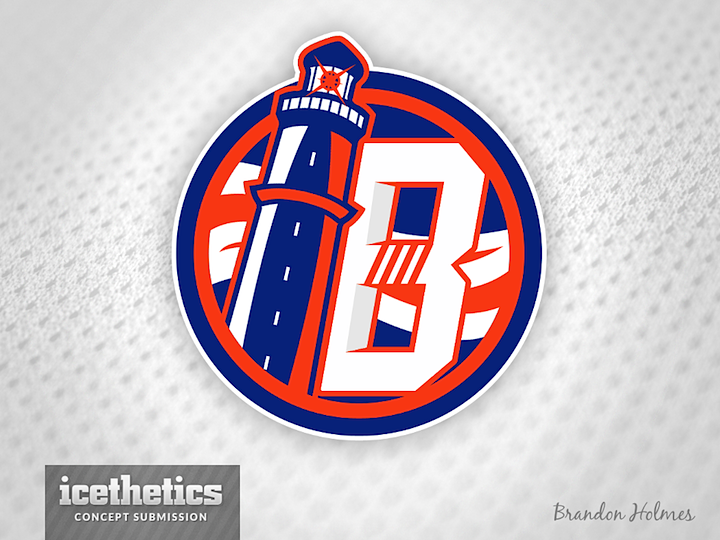
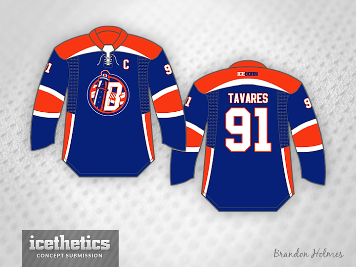
I thought I'd wrap up our Islanders Sunday series with a phenomenal logo and uniform designed by Brandon Holmes. He's come up with an alternate logo for the Brooklyn third jersey inspired by the Isles' lighthouse logo of 1997. I give it a huge thumbs up!
With the Olympics around the corner, we'll switch back to International Sundays next weekend!
Designed by  Brandon Holmes
Brandon Holmes 
Reader Comments (8)
Beautiful logo. It should be used by NYI. That jersey however, it needs a little reworking.
That's a great looking logo Brandon's got there. I'd like to see the side panels go all the way up the jersey vs stoping thought.
I dont really care for this. The jersey looks like it should be for the Edmonton Oilers while the logo is nice something about it seems off. Maybe switch the lighthouse to the opposite side of the B would help..
This one is REALLY close! 4 stars! The horizontal lines in the 'B' are currently level to the ground, where my eye suggests that they should be tilted downward to be consistent with the forward slope that both the 'B' and the lighthouse are on. Excellent concept. The Isles should really move their entire identity this direction - one that doesn't abandon their history, but also acknowledges their present and future.
I don't get what's so great about the logo. Is the lighthouse an 'I'? It looks like an "IB" to me . And does the NHL need another team with a B-in-a-circle logo?
Nice jersey and logo. But again, why the four Stanley cup stripes? Never see a Rangers concept with four stripes or a Bruins concepts with six stripes, or a Maple Leaf with thirteen stripes, or a Canadians with .............
I like the logo, but I'm not a huge fan of the lighthouse. Maybe I'm just being a picky Long Islander, but there aren't any lighthouses on LI that look like that.
I definitely fall into the "Not a fan" category. I'm not sure why many of you seem to like it. Seems kind of boring to me, while at the same time seeming overly "busy".
Is there a reason that the lighthouse is a leaner? Is it modeled after an actual leaning lighthouse in Long Island?