


Thursday
Nov212013
0643: The Flames IceBorn
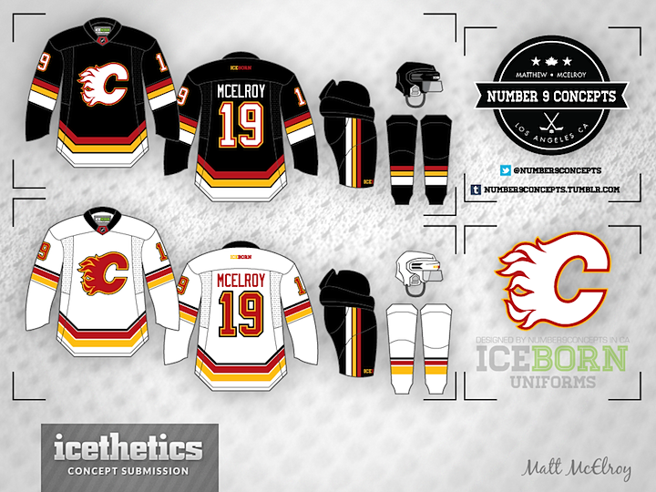
Today, Matt McElroy gives the Calgary Flames the IceBorn treatment — IceBorn being the jersey template he designed, which you can find by clicking on the Templates button in the sidebar. It's got a bit of a Team Germany feel, but it's not a bad look.
Designed by  Matt McElroy
Matt McElroy 
Reader Comments (7)
i REALLY like both of them but i can't help but thinking that the black jersey needs a little more red somewhere.
Throw in a red sweater and you're done.
I like the jersey design, but I'd like to see it with the 80's/90's Vancouver Canucks logo. The dark jersey especially (although I see some resemblance with the white as well) reminds me of the early '90s version with the red and gold striping.
This makes for quite the German national team jersey.
Agree with JeffB this looks like a great new update for the Canucks . . . if they had never brought in that stupid orca. Alternatively this could also work for Team Germany. Anyway I like the design but I don't like it for Calgary. The Flames do not need black anywhere on their jerseys. Red and yellow was good enough for Hulk Hogan it is definitely good enough for the Flames.
I really like these. They remind me of the Canucks old uniforms, which I'm a big fan of. :D I would love to see a bright red version of the black jersey here, with that awesome white 'C' logo. I also think you should put a red shoulder yoke with the same style pattern as the stripes on the waist and the arms on the white jersey just like the original white Flames jersey and switch the black pants for red ones. I must say, I find that this ICEBORN template is very clean. From what I've seen, every concept made with this template has always looked sharp and incredibly detailed. Keep it up, great concept.
Both of these look pretty sweet. Nice, simplistic design that I could see people wanting to buy if it was Calgary's jerseys. I don't know if I would make the black one the new home sweater but it would for sure be a sharp third.