Tuesday
Dec102013
0662: Ohio Pride
 Tuesday · Dec 10 · 2013 | 8:00 AM PST
  15 Comments

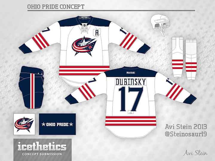
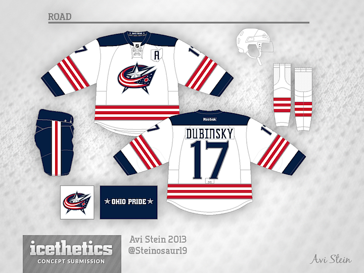
Today we get a neat alternate jersey design for the Blue Jackets from Avi Stein. He writes:
I think that the Jackets should try to market themselves better to the entire state of Ohio, as a lot of people from the Cleveland area follow Buffalo, Detroit, Chicago, Pittsburgh, etc. So, this uniform speaks to the fan-base, and solidifies the notion that the Columbus Blue Jackets are indeed Ohio's team.
Update on Tuesday · Dec 10 · 2013 | 10:48 PM PST by
 Chris
Chris
 Chris
Chris

After seeing your feedback, Avi revised his original design and added a blue one. Thoughts?

Designed by  Avi Stein
 Avi Stein


Reader Comments (15)
They look too much like a Team USA jersey if you ask me.
ummm.... why isn't this already their regular white jersey?
This would look cool if you reversed the stripes and made those blue on the arms and socks and did the cuffs in red.
Great jersey! Nice balance between the red, white, and blue. Would love to see a home version of the jersey...
Also, kudos on the Cleveland Barons/ohio outline for the Alternate/captain letter!
I like these a lot. The only thing I am unsure of is the faint silver outline on the stripes and the numbers, but since it isn't really a distraction I would leave them there. I really like the state outline around the alternate captain's designation. A small nod to the NHL version of the Barons.
Not a fan. Huge CBJ fan, but this looks disjointed somehow, like the strips and yoke clash. I do like the 'A' patch tho. I've seen this in other concepts and it would be a nice touch.
these are amazing, the new best I've seen on this site
How about a bolder font for the nameplate? I've always found their names to be hard to read. Then again, I've always wondered why Columbus is even in the NHL.
Thanks guys for the praise. I just sent an updated version of this, along with a matching home jersey to Chris.
Is it in the rules to switch templates mid design? I kid; I'm a big fan of both
I love it, but why'd you change the template on the updated versions? They look too fat and the arms are too short.
These are excellent, great balance of colors and a nice clean look. Time to put them on the ice.
This team serves no purpose in the NHL. Why are they there? These look like team USA sweaters.
I live in Columbus and am a huge fan and I love both of these!