Monday
Dec092013
0661: Future of Vancouver
 Monday · Dec 9 · 2013 | 9:52 AM PST
  9 Comments

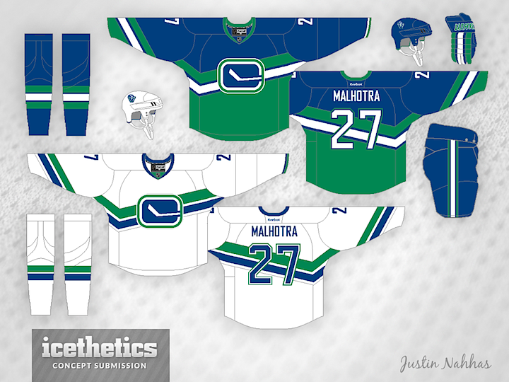
As we look to more modern jersey designs with the new Stadium Series threads, check out this Vancouver Canucks set from Justin Nahhas. He was inspired by the team's original third jersey from the 90s, but it's still a very cool look.
Update on Tuesday · Dec 10 · 2013 | 10:45 PM PST by
 Chris
Chris
 Chris
Chris

Justin read your comments and put together a few alternative designs.
Designed by  Justin Nahhas
 Justin Nahhas


Reader Comments (9)
I like the white one a lot. Too much green on the dark.
Conceptually it's great, I love the road jersey, however the home jersey should be blue not only above the stripes, but below. Changing the lower colour to aqua merges it with the second stripe, which then makes it seem out of synch with the other shirt. I'd like to see the upper and lower jersey's match.
very interesting. i especially like the white version and can see something like that happening one day in the future. the dark version might be a little too out there for now, but i like the thought behind it. (gave these 5 stars.)
I think if you aligned the stick of the logo with the space between the two stripes it would look a lot better. I also don't like how there is so much green in the blue jersey and only a stripe in the white, I think it would be better if you took out the bottom green part in the blue jersey too.
Love the white one, but as others said, change the dark one to be all blue. And maybe make the logo white. And a green third would look fantastic.
I love the white one. Maybe put the piping from the non striped arm on to the bottom of the jersey too.
The problem I have with the dark jersey, and with a lot of green and blue canucks concepts, is the lack of white to balance the green and blue. Its too in your face when they clash on the jersey, and they don't merge well.
Not bad! I have always thought that this logo should be the Canucks' primary logo. I love their current third
While Interesting, and a nice take on the old 3rd, It seem to be just a little off.
That or i'm just thrown by that it has Malhotra markings and he's been a 'cane for a while now.
Even though the skating Johnny Canuck is my first choice as the primary identity of the Canucks, I would be just as happy if the updated Stick 'n Rink and its clean simple look got promoted to full-time status.
What I also like are the traditional block numbers with green accents. Not the dull Agency font which I see on the arms of the concepts.