


Friday
Dec132013
0665: Flyer Freak Out
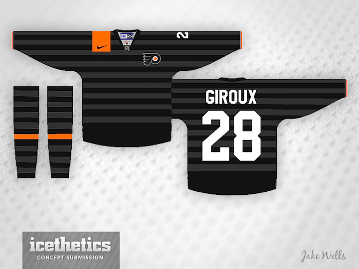
We were so close to concept number 666 landing on a Freak Out Friday the 13th! How disappointing. But that's not going to stop me from trying to give you a little scare. This Philadelphia Flyers jersey was designed by Jake Wells but it's absolutely something we could imagine Nike trying, isn't it? Let's hope they never get the chance!
Designed by  Jake Wells
Jake Wells 
Reader Comments (8)
This looks very similar to the Netherlands' soccer team's previous away jersey that they used in 2012. Just doesn't look right on a hockey jersey.
Funny that you would say this looks like something Nike would do, Chris... Look at the black Netherlands soccer jerseys!
i actually really kind of like this. the only thing that really (really) bothers me is the nike swoosh and how it seems to the be the center of the design. put the flyers logo in the orange box instead and this would be an A+ freak-out friday submission -although it does seem to borrow too heavily from that netherlands kit.
I actually really like this. People will complain it looks like a soccer jersey. But who cares soccer kits look great; I'm tired of the same 4 jerseys in the NHL. Doing something different is good it's what keeps us moveing forward. If this were the new trend I would totally bug into it.
While I could see Nike trying something like this, I have to say...no. No no no no no!
Nearly jumped out of my chair.
It's almost like Nike. Don't forget the 2 mini Stanley Cup replicas on the bottom of the jersey and the fake laces (if it's not already there). Great effort, however, I would not like to see it in a game. It would make a very good T-shirt to wear in the spring and fall.
I like the basic look, maybe as a practice jersey, or modified into golf shirt.
But for a game jersey, only if the Flyers were to join an indoor soccer league.