Thursday
Dec262013
0678: Stars Back in Black
 Thursday · Dec 26 · 2013 | 8:00 AM PST
  12 Comments

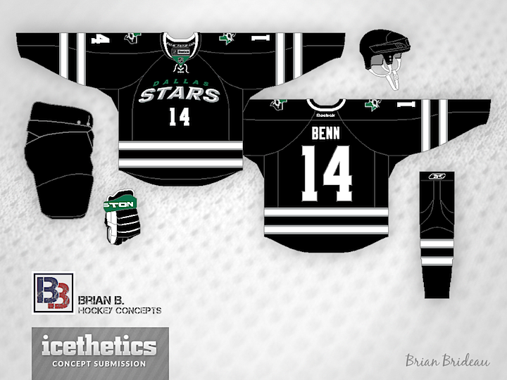
Brian Brideau offers a wordmarked black third jersey for the Stars. Too soon?
Designed by  Brian Brideau
 Brian Brideau


Reader Comments (12)
No. Never. Please, no. ;)
no no no. on so many levels, no.
(the overall design of the jersey is nice, aside from the chest logo/ number. would look good for a team that has black/ white/ silver for colors.)
LMAO what the hell is this
Nope, nope nope nope
Although I do think they would look good in a black alternate having seen black practice jerseys with the new logo on it
This design signifies what they wanted to get away from with the word mark. While it is a nice idea to mess with, I would never want to see it on the ice nor would the Stars put it on the ice.
NO!!!!
Finally got rid of those things, don't want to bring them back. A black alternate would be great, but not that...
(More along the lines of the '93-'99 look w/ the new or alternate logo (shoulder patch) would look good)
NO. NON. NEIN. NYET. sorry, definitely not a fan of this design. and yes, it is too soon!!
The wordmark being both slanted and arched creates a bizarre, warped effect, and I've had to look a couple of times to make sure my eyes weren't fooling me. That would be the only thing I'd fix, others' issues with the last Stars look aside.
I think this would make a great alternate, which I'm sure was his intention. Not to replace the beautiful green set. Surprised the rating is so low, this is solid.
I like it, surprisingly, usually not a fan of black or word marks but this looks nice. Kind of reminds of the original stars unis, but I would use green for the trim color instead of silver, you gotta have green to make it stand out or it looks to dark and you run into the same problems they had before with the lack of color in the previous jerseys.
7.5/10
It needs some sort of green...but honestly, anything that's not that damn ninja-star logo is a sizable upgrade.
Change the crest and add some green and you've got a great 3rd jersey. That striping pattern is a throwback to one of their older north stars jersey if I remember correctly.