0369: Reviving the Golden Seals
 Thursday · Feb 21 · 2013 | 9:01 AM PST
  11 Comments

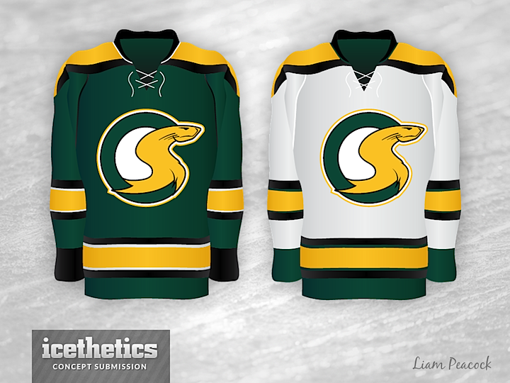
We wrap up our week of team revivals with a humorous take from Liam Peacock on the California Golden Seals. Liam imagines a world where the Seals didn't leave the Bay Area in 1976. Within this alternate history, he's created a progression of uniforms the team might have gone through over the years — based on the styles and trends of the NHL.
I was amused at what happened with the team's look in the '90s — a "style" problem that plagued real NHL teams like the Sabres, Oilers, Islanders and Capitals. In the early 2000s, a simpler-is-better approach started to emerge. And by the late 2000s, a lot of those older teams made modern updates to their classic uniforms — like the Sabres, Oilers, Islanders and Capitals.
 Chris
Chris

Liam read your comments and made some revisions as well as an additional jersey design.
 Liam Peacock


Reader Comments (11)
That 90's logo :O
I love stuff like this...thanks!
I am having a hard time figuring out what is even in the logo for the 90's styles, but I'm actually digging the '09 sweater!
This is very clever. I really think the last concept would look amazing with some tweaks to the logo.
Lochness Monster to Shark face to Shark face to Gopher to Gopher to Snake. What.
Pretty cool idea.
95, 98, 09 look more like Snakes though.
That's decently funny, points for the 90's satire. However, I'd like to point out that the logo on the "classic" jerseys looks more like the Loch Ness Monster than a legitimate seal.
The 2009 logo.....it looks....quite....well....phallic.
The internet has wrecked me.
The logo used on the 1979 jersey is the best of the bunch. Why change something that isn't broken?
Presumably, the creature in the 90s logo is meant to resemble a demon from hell, but it looks surprisingly a lot like a seal. Just a thought.
A few things you might have missed:
1979: A few teams started having similar looks close to this time. The Bruins were upset at the Penguin's new black and gold sweaters, the Oilers came in the with an identical colour scheme to the Isles, and Winnipeg flat out used the same jersey as Ferguson's Rangers. This borrows heavily from the North Stars. Also, initials with abstract images were en vogue. See the Nordiques particularly.
1995: Based on the Penguin-eating leopard seal, which is about the only thing mean enough for the 90s. The real leopard seal hardly looks like a seal, let alone this logo.
2007: I'm actually really disappointed nobody complained about this monstrosity yet. Some decent early-2000s designs were completely wrecked by the edge template (Penguins, Flames)
2009: Also disappointed nobody complained about the piping. Yay piping.
To Louie, I sent Chris an updated 2009 jersey with less obtrusive piping, a fatter, whiskered seal, and a visitor's white version. If he posts it, I hope you enjoy it.